The Color of February // RED in art & design

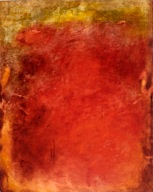
The color red is filled with meaning.  It’s found in nature - in red roses and robins. It's spiritual -  the symbol for luck and it's the first chakra in Sanskrit.  It has history and special meaning in various cultures around the world.  It’s political - as in the red states, and it's emotional, symbolic of both anger and love.  The red or root chakra provides stability, groundedness and trust, red symbolizes power and strength, it encourages action and enthusiasm. In addition to the inferred meanings, the color red has a significant visual impact  when used in art & design. Artist Anne Raymond, on red and her red paintings,  “Red is strength, it’s the pigment of passion and confidence. Red is energy known, felt and intended.”  Anne spoke with me about the appeal of her red canvases and how some naturally gravitate towards it and others may choose it in small doses.

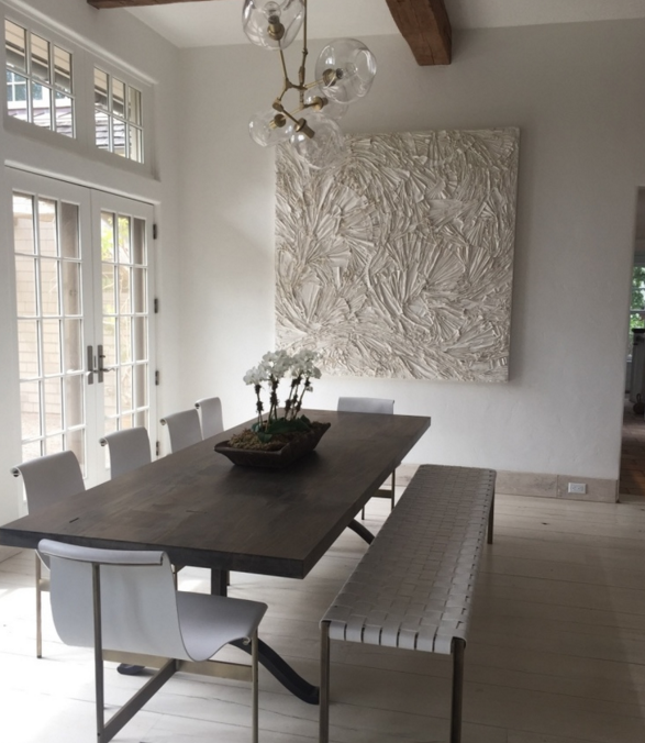
For those who love it,

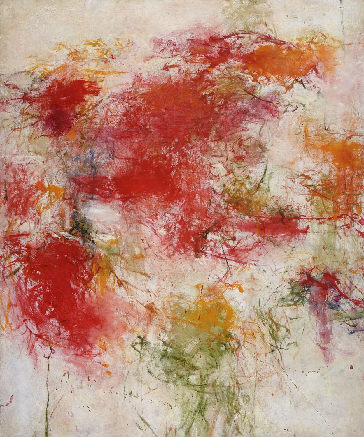
or with white, negative space and additional colors, for a quieter canvas, named for the red pigment, Cirrus Cadmium

Photographer Bonnie Edelman captures the natural beauty of red in a stunning sky

Abstract Expressionist  Barnett Newman often used red and other strong flat primary colors in his noted Zip paintings, as in “Who’s Afraid of Red, Yellow and Blue”

I love the contrast of the flowing red scarf in William Wegman’s, “Red to Head”, one of his Weimeraner photographs

Red has found a place in many familiar idioms, Seeing Red, Red carpet treatment, Caught red-handed, Red flag, Red tape and In the red are just a few. It’s pretty interesting to focus on this and see how this color, and the word are in our everyday experience.

Red is in the name of many iconic brands: for a cause - Bono’s (Red), The American Red Cross, in sports - Boston Red Sox, to signify energy - Red Bull, for achievement - Red Ribbon.

Red is used visually  to create strong brand identitly

for New Yorkers, the fun and much adored Milton Glaser designed symbol,

Artists and designers use red to fill an entire canvas, a product, or room -  when the goal is a bold statement to elicit a strong emotional effect or they use it as an accent to provide a stroke of contrast and energy.

In fashion, like art, red is classically used to make a statement.

Charles Louboutin red soles are iconic. The NYTimes, recently refered to”The Little Red (Litigious) Shoes", The company is suing the YSL brand claiming that their red shoes infringe on the trademarked, “Red Sole Mark”.

Louboutin red,  from classic

to outrageous

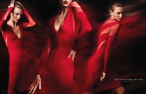
Designer Donna Karan is identified with clothing that empowers - red from her Spring 2012 advertising campaign

Double red, Reese WItherspoon on the red carpet in a striking red Zac Posen dress

The use of red in home and furniture design provides impact whether used in large amounts, or sparingly. Iconic modern furniture combines strong silhouette and color.

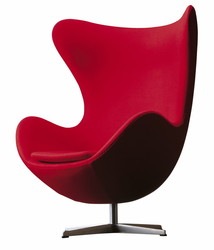
The Egg Chair, by Arne Jacobsen

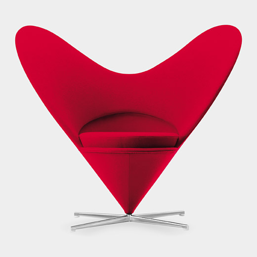
The Miniature Verner Panton Heart Chair

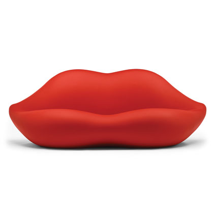
Heller’s, Marilyn BOCCA sofa, 1972

A bold use of color in a room, walls painted with a saturated deep red, Benjamin Moore’s, Million Dollar Red and red upholstered furniture in a classic room, by designer, Bibi Monnahan

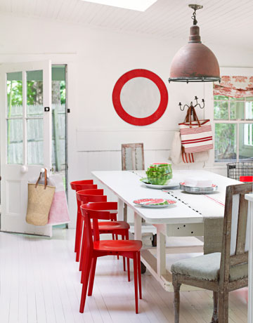
or red as a dramatic and effective accessory, chairs and wall decor in a fresh Hamptons home by Ilene O’Neil

Why RED?  because it’s February and the color is synonymous with Valentine’s Day - red roses and the celebration of love.

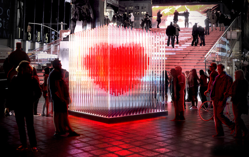
Exhibiting in Times Square for the holiday, a 10 foot tall installation with 400 LED acrylic tubes around a big red heart.

“the interactive art piece pulses with a glowing red luminosity whereby, people's interaction with one another intensify the beating of the brightly, burning heart”

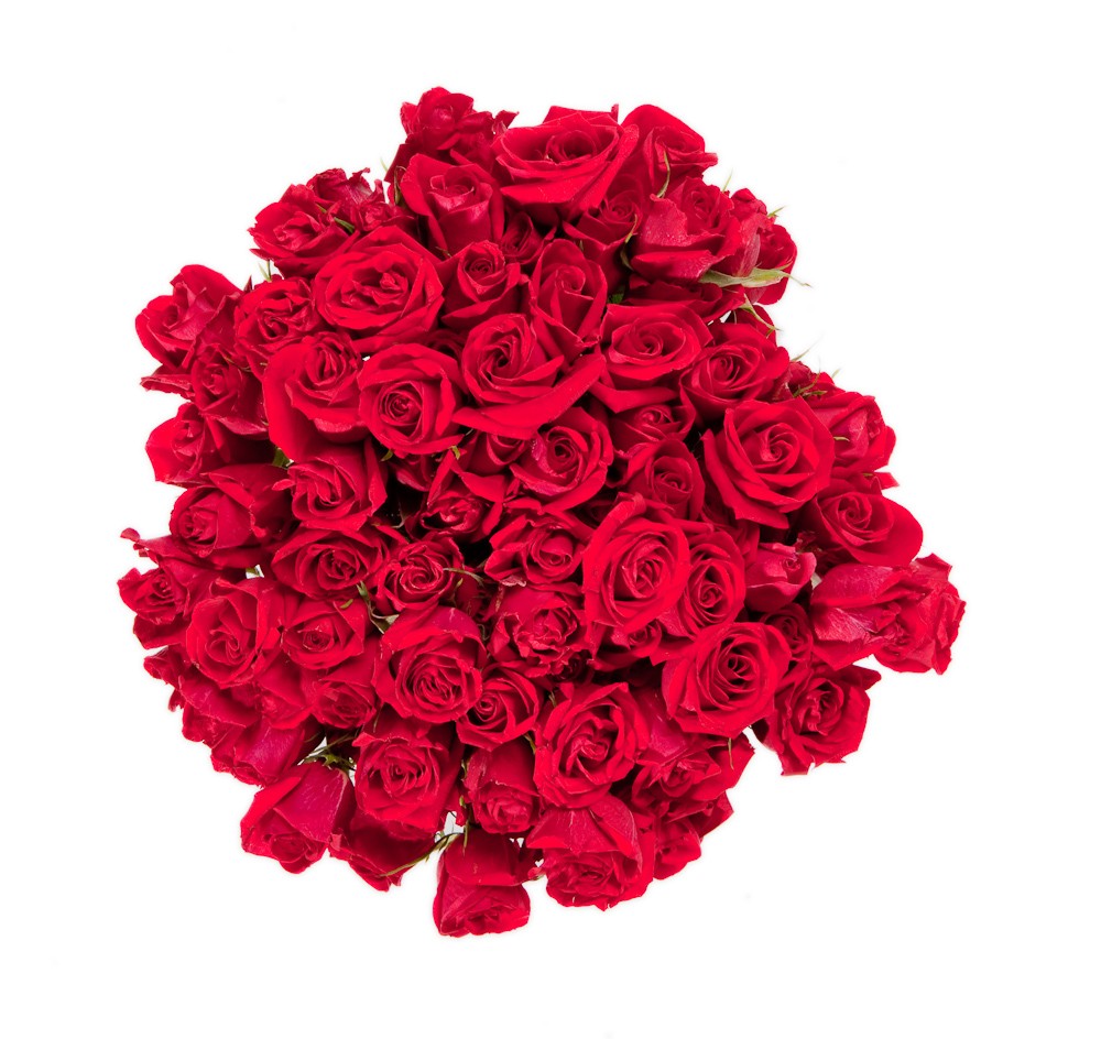
and classic RED - 75 gorgeous red roses


Tangerine Tango // Color of the Year 2012

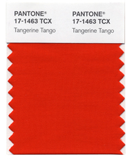
Last week, Pantone, Inc. announced that Tangerine Tango #17-1463 will be “The Color of the Year 2012”. This was big news and cause for lots of review and discussion in the design worlds.

“Sophisticated but at the same time dramatic and seductive, Tangerine Tango is an orange with a lot of depth to it,” said Leatrice Eiseman, executive director of the Pantone Color Institute®. This robust color was descibed as a “spirited reddish orange”, and will “provide the energy boost we need to recharge and move forward”.

Eiseman continued, “Reminiscent of the radiant shadings of a sunset, Tangerine Tango marries the vivaciousness and adrenaline rush of red with the friendliness and warmth of yellow, to form a high-visibility, magnetic hue that emanates heat and energy.”Pantone Inc, the NJ company, began as a source for printing guidelines. It has evolved to create standardized color palettes for a number of industries, including graphics, fashion textiles and interior design. PMS, the Pantone Matching System, enables color to be consistent across industries, from paints, to printing ink to textiles to lipsticks.The selection of a particular color is a thoughtful process. Pantone “literally combs the world looking for color influences....including the entertainment industry, art, artists, technology, sports and socio-economic conditions..”  The color chosen will subsequently impact many industries and individuals.Oranges and reds are warm colors associated with nature, with daylight or sunset. Color Theorists describe the usual strong reactions to orange, more so than other colors, it's a “love it or hate it” color. It radiates warmth and energy. Bonnie Edelman’s photograph, Campo Sunset, comes to mind with the description of the energy of the red hues.

and Golden Campo is on the other side of the spectrum, the warmth of yellow.

When I was a textile stylist, creating colors and patterns for fabrics for men’s clothing, I eagerly awaited the trend reports, forecasting the colors of the season to incorporate into our seasonal fabrics. This is true for stylists and designers across creative fields. The result is a consistent theme for the seasons, and it starts here - with the selected colors by Pantone.

According to Apartment Therapy, Tangerine Tango, “.... is a highly-usable color for interiors. It's very easy to incorporate into a room as an accent, although the full wall treatment is absolutely an option for those willing to take the plunge.”.  It has always been a good color for interiors, it works as a standout accessory against neutrals.  Apartment Therapy showed these examples, from a complete orange wall, to a bold orange sofa in a neutral room.

and acessories, a way to introduce a small accent of the warm color to any room

Apartment Therapy

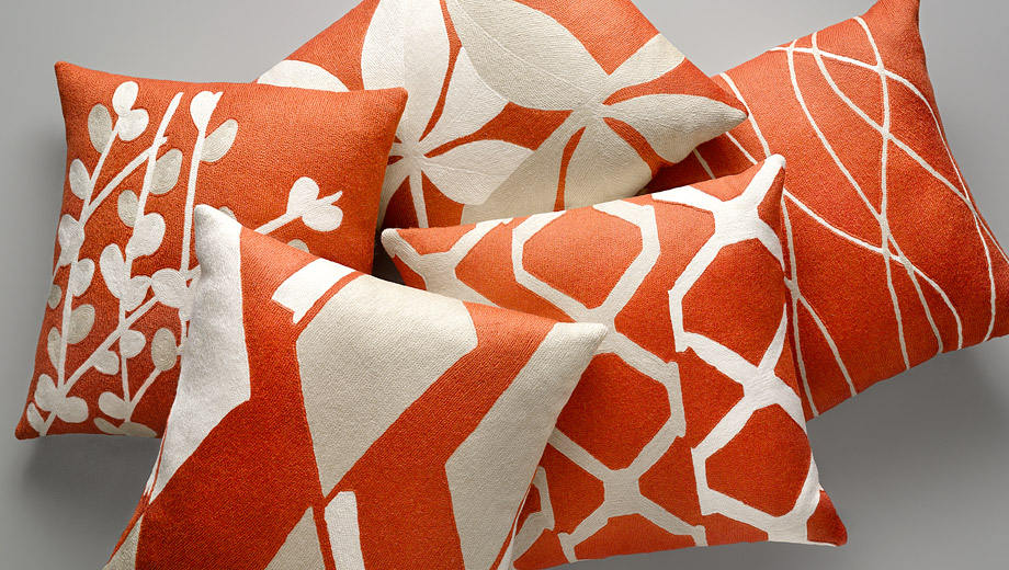
Judy Ross Textiles, a favorite pillow source,  has a beautiful group of hand-emboidered pillows with the uplifting color - perfect for accessorizing

The same is true for clothing and make-up. When my husband wears his orange sweater, (instead of his usual black!) he feels lighter and brighter and the color elicits a smile from others. Expect to see more of this reddish orange in the coming year.

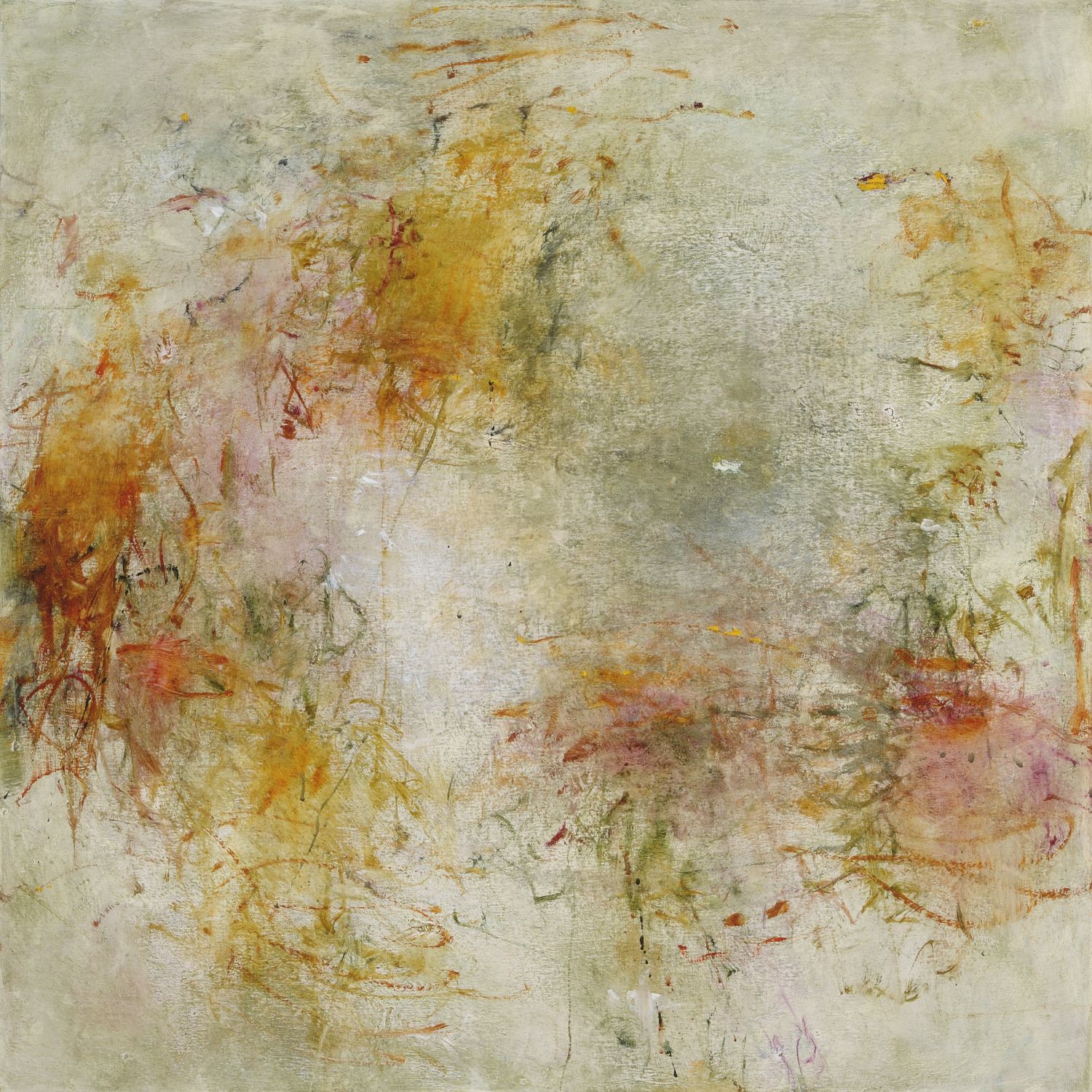
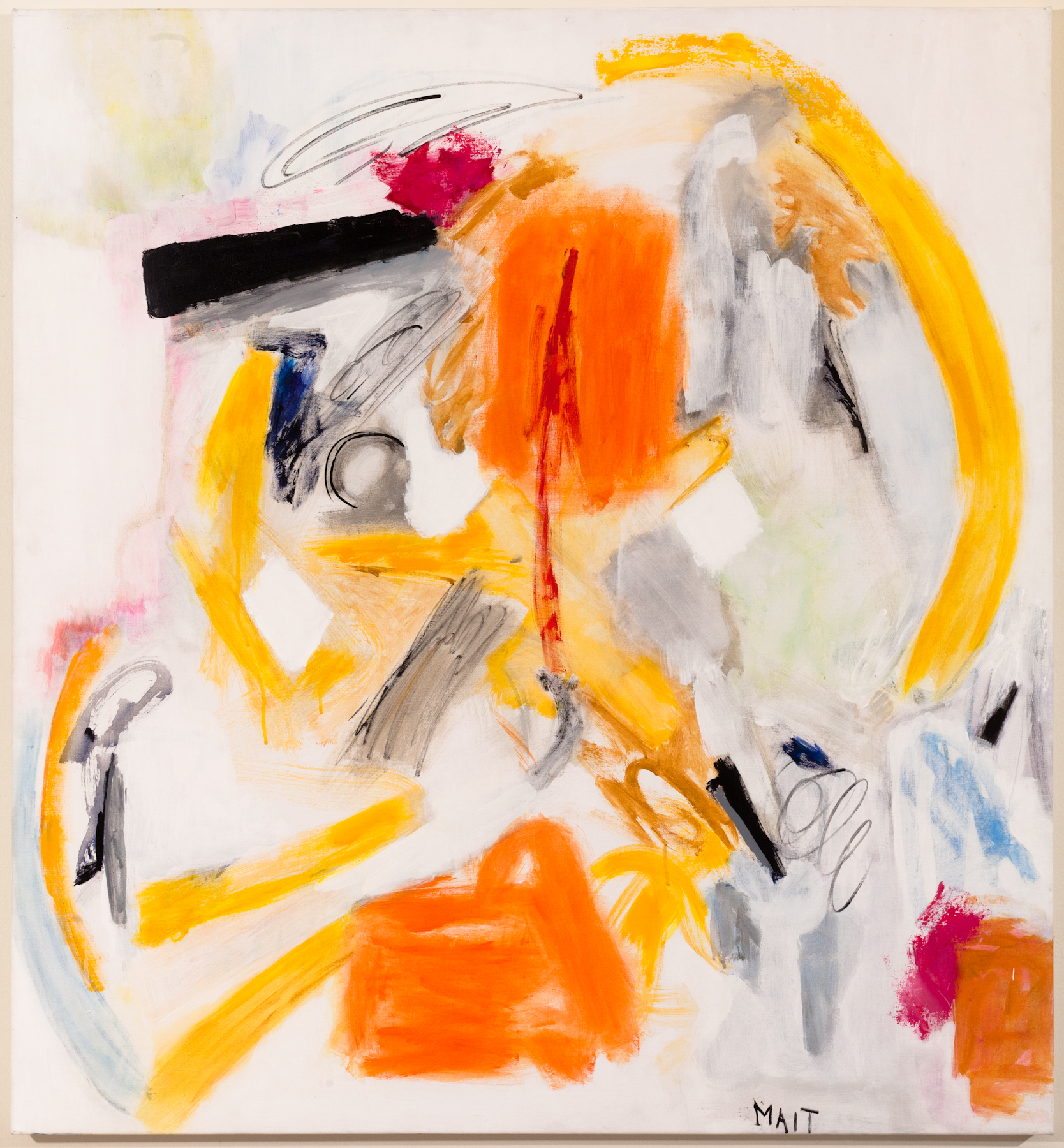
I have seen a strong and positive response to orange in artwork, from the sunsets above to the color-soaked paintings by Janet Mait and Anne Raymond below. The bold color makes an impact, and as the description of Color of the Year says, they are strong and in turn provoke an emotional response.

to the natural sky of Nightlight, by Stuart Zaro

Tangerine Tango, is an early 2012 prediction...and there will be many more in the next few weeks as the calendar rolls to the new year. Pantone Color Institute selected a color  of nature that is warm and has a positive energy - as they suggest, to help recharge and propel us into 2012.

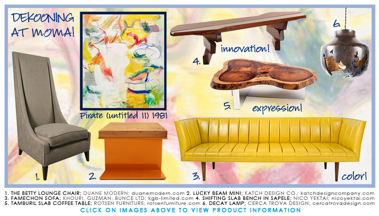
de Kooning at MoMA // on a Saturday afternoon

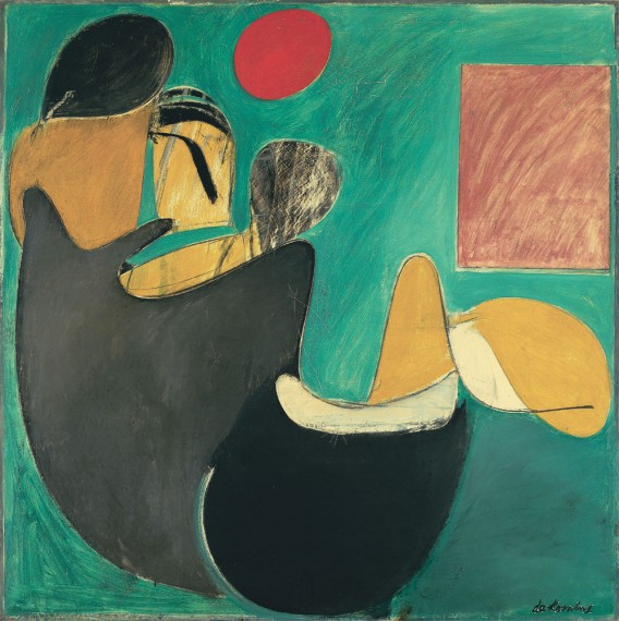
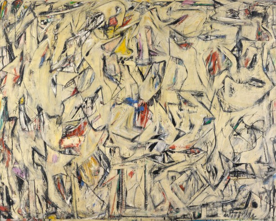
MoMA on a Saturday?  I wasn't so sure I was up to weekend crowds. Alexis, my daughter and I had been wanting to see the much talked about Wm. de Kooning Restrospective since it opened in Sept.  She and I often explore musems and galleries together, but this week, my son Brett, uncharacteristically offered to join us...so Saturday it had to be. The Museum of Modern Art exhibit is the largest retrospective of deKooning’s work.  de Kooning, an Abstract Expressionist, is considered among the most important and prolific of the 20th century. The show spans his early work after arriving in NY from the Netherlands in 1926 through his more recognized abstract paintings in the 80’s. An exhibition of this breadth gives the opportunity to follow an artist as they evolve and transition from one stage to another. Since the exhibit opened, I have read and talked about it.  Exhibitions of this significance inspire those from the art and design worlds, from interiors to fashion. I’ve discussed de Kooning’s work with several painters I presently work with. Each artist has their unique style;  Anne Raymond's nature-inspired color studies. Tracy Burtz's beautifully executed figurative women and Janet Mait's bold color statements. Each spoke about how this exhibit was inspiring to them,  how wonderful it is to see the colors and compositions of de Kooning's original works.

Interiorconnector, a site for "haute home furnishings", wrote that, "de Kooning's work not only incites us to experiment more with color and shape in our homes, but the paintings themselves inspire us to go bolder with the artwork we purchase", and goes on to make recommendations for art and furnishings that will provide a touch of de Kooning's "spirit and attitude".

Interiorconnector, The Spirit of deKoooning Lives at MoMA

The perspective of my two children and the conversation added yet another dimension to the art, as we walked the exhibit. Alexis commented on this still life, done when he was just 14 years old. The composition is similar to those done by all young art students, including herself, and today would be part of a college portfolio.

In the early abstracted works, he often mixed figurative imagery and abstraction, mixing both within one composition.

The black and white compositions in the late 40’’s were the first of his exploration of little or no color. de Kooning played with color, as well as the compositons, putting many elements into many of these paintings. “I’m not interested in ‘abstracting’ or taking things out or reducing painting,” de Kooning said in a 1951 New York Times interview. “I paint this way because I can keep putting more things in it: drama, anger, pain, love, a figure, a horse, my ideas about space.”

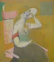
de Kooning returned to figure paintings, mostly women, at different times, painting them both figuratively and abstract throughout his career. Brett, not having the patience to read the wall tags, went to his phone as he’s accustomed to, to deKooning’s Wikipedia page to read and learn about the artist and his art. He wanted the facts - he was Dutch, 1907-1997.  At auction, Pink Lady sold at Sotheby’s in 1987 for $3.6 million, the value of his works have increased. Steven A. Cohen recently bought Woman lll from David Geffen for $137 million.

In the mid-50s, he painted abstracted urban and pastoral landscapes. Once outside of the city, these paintings were lighter, warmer, more color...both strong and pastel. We drive on the Merritt Parkway often, so to see what deKooning reduced the familiar landscape to led us to a good discussion about form and color.

The same thing with L.I. - there were several Montauk paintings in the 40s and again later on when de Kooning, along with Jackson Pollock, Lee Krasner and other Abstract Expressionsists lived and worked in the Springs in East Hampton

We walked the galleries talking about the different period of his life, color, and the changes in de Kooning’s work as he transitioned from a loft on West 22nd st in 1937 drawing figuratively.

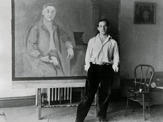
loft on West 22nd St., 1937

to a studio in the Springs on L.I. in the 80’s surrounded by bold and colorful and accomplished abstract canvases.

Studio with Late Abstract Paintings, Springs, 1981

We ended our visit in the Architecture and Design Exhibit, where there was something for each of us. Alexis, an art director at a digital agency, was interested in the Gotham exhibit - a visual display and description of one of the most successful new typefaces, created in 2000 by Jonathan Hoefler and Tobias Frere-Jones. The font is inspired by NYC urban signage. It was the font used in President Obama's 2008 Presidential campaign and also the identity of the new One World Trade Center.

and Brett found new folding chairs to add some modern style to his tailgates at the NY Jets football games, Meeting Chairs by Lauence Humier.

and for me, it was a great day finally seeing the de Kooning Retrospective and walking through MoMA with my two kids on a Saturday afternoon.

October // a Pink Month and Women at Risk (WAR)

National Breast Cancer Awareness Month, NBCAM, has grown into an international event, promoting breast cancer awareness and information. The mission of countless organizations is to provide women with greater access to screening services and large fundraising efforts for continued research and support. For me, as for many, it hits close to home, I think about and remember friends, and others, who have had or have been touched by breast cancer. My son Brett, asked me recently, “How and when did Breast Cancer Month become so big?” while I was working on a partnership with Women at Risk, LV2BFIT and Paintings by Janet Mait for this month. There are so many events through the year, “months” that acknowledge many diseases and organizations. Why does breast cancer receive so much attention?  There is not a single “answer”, rather a culmination of public awareness, serious marketing, and so many individuals and families touched by the disease who have chosen to work tirelessly to create and bring the attention to the month of October. Brett, a football fan, filled me in on how the NFL acknowledges Breast Cancer with an abundance of pink gear on the field and with significant fundraising. The New York Times feature, Sunday, Oct. 16th, reported on the “Pinking of America”, the article focuses on the Dallas Cowboys, Nancy Brinker and the Susan G. Komen Foundation - and the extent of the marketing and promotion of “pink” .  It is due to the zealous and unwavering commitment of Nancy Brinker and players like the Houston Texans wide receiver Derrick Mason (again, Brett shared this with me) who will wear pink cleats this season to honor his mother on the field - those who have spoken out loudly on the subject of breast cancer.
NBCAM started 27 years ago, in 1985, with a week long event to provide info and awareness about breast cancer. It was a partnership between the American Cancer Society and a maker of several anti-breast cancer drugs, Imperial Chemical Industries. The goal was to promote awareness of early detection through mammography.

In 1991, the first pink ribbon was given out to participants in the Susan G. Komen Walk for the Cure in NYC. In 1993, Evelyn Lauder, of the Estee Lauder Foundation, established the pink ribbon as the symbol of breast cancer.

In 2009, NBCAM celebrated 25 years of Awareness, Education and Empowerment. The event spread nationally, and has now become an international event, with supporters, activities and fundraising worldwide.

Women at Risk, WAR,  at New York Presbyterian Hospital, was founded in 1991 as a grassroots partnership of physicians and patient/volunteers focusing on early diagnosis.  WAR has expanded, growing to meet the needs of women in the New York Metropolitan area for women at high risk for breast cancer and also for women undergoing treatment.

My dear friend, Laurie Bass Sklaver, became involved with WAR after diagnosis and treatment for breast cancer at NY Presbyterian, first as a board member and then as President. A number of Laurie’s friends joined her at this time, inspired by her motivation to help others, who like herself, had to cope with the process, from diagnosis to treatment and more. Together, we joined Laurie and WAR, attending the annual luncheon and supporting their mission. In 2004, The Laurie Bass Sklaver Symposium was created by Laurie’s family in her memory. In recognition of Laurie, and her postive energy, this event follows her beliefs that knowledge was the first step in the fight against breast cancer. The annual Symposium provides in-depth information and discussion on a different topic each fall.

For me, it is always with Laurie in mind, that I want to do “something” in October.  As I imagine it is for so many others as they think about their friends, mothers, sisters and the other women in their lives who have been affected. Breast Cancer awareness is a successful month, as a result of impassioned and determined people.

Today, millions of people worldwide come together to support efforts on behalf of breast cancer in the month of October. Breast Cancer has touched and resonates with the families and lives of so many ... and that must be the reason it has grown and has made October a month to celebrate, donate, support, learn and shop, for the cause.

Armonk Outdoor Art Show // Paintings by Janet Mait

Also this week, we’re preparing for the 50th Armonk Outdoor Art Show this weekend. Janet Mait will be showing paintings from her New Shoes Collection. The event is sponsored by the Friends of the North Castle Library. The event supports the library, it has become a Fall ‘go to’ event for many.

It’s been raining while the tents were being set up today and the forecast is not great for the weekend...its a well-attended show and a great way to spend a Fall weekend. So, hoping for some sun, or at least a break from the rain. Several months ago, Janet and I talked about and planned for the Armonk Art Show, its very different from a gallery setting. When we spoke again recently, she talked about preparing to paint and planning for the outdoor show.

“I begin my day by biking through Central Park to the Art Students League …when I  get to the studio I set up. then eat my lunch contemplating and planning my next move. Often, I use my headset and listen to Opera at the same time.  The combination of the exercise, the thrill of biking in NYC, my music, all contribute to an exhilarating feeling when I paint.

After having a show in Chelsea….I am looking forward to the very different venue of the Armonk Arts Fair…another opportunity to share.”

We are both looking forward to a fun, new experience...and hopefully a dry one!

Janet's positive energy comes through her work, through the vibrant colors and strong compositions. I enjoy seeing the responses the paintings elicit, “...they’re happy paintings” and “they make me smile!” are typical comments. This speaks to Janet and how she has come through a difficult time in her life with strength and optimism.