Color // Hot Summer Days

Summer means different things to different people, but consistent among summer plans is to vacation, relax and enjoy the outdoors whether it's by the beach, lake or in the mountains. The days are longer in the summer months, and we seem to collectively fill them with activities and people we enjoy. The warm colors in these artworks, that range from red to yellow reflect the warmth and light of the long summer days. In the color spectrum, there's a wide range of colors between red and yellow including the many shades of orange.

Anne Raymond's Change Series l gently captures the warmer tones of these colors.

Abstract Expressionist Mark Rothko painted many Color Field works in these hues. His 1961 painting, Orange, Red, Yellow sold for a record $86,882,500 in May 2012. The New York Times reviewer said it "...can convincingly be argued to be the most powerful of all his pictures."

Color theorist Josef Albers explored the sunny colors in numerous works in his Homage to the Square series.

Referencing summer, Kelly Crow of the Wall Street Journal stated about Rothko, "The painting's trio of orange and yellow rectangles bobbing atop a cherry-red background forms a palette that's as eye-catching as a sunset or a Popsicle."

Photographer Elisa Keogh captures that kind of intense summer sky in Long Beach Island, NJ (red-orange) from her Horizons series.


Crow adds that, "Auction specialists say collectors historically pay more for works that are red and gold, as opposed to gray".  Red is the color most associated with joy and well-being, so its no surprise that we surround ourselves with the joyous color.

Joyful and summery describes Kerri Rosenthal's colorful, energetic artwork, including Pretty Wings with a golden citron color, that's on the green side of yellow.

Images of the ocean and beach evoke great memories and associations for many. Bramasole Photography  captures inviting images of her favorite beaches. (I blogged about a recent exhibit of Christine Wexler's work.) In Surf Camp, the surfboards in Montauk are ready to go!

Some prefer summer walks or hikes in the mountains.  Feel the breeze in Elena Lyakir's, Laughter.

Time in or by the water - ocean, lake or pool is summer to many. In Turning, from a series of underwater photography, artist Andrea Bonfils' conveys the weightlessness and welcome of the water.

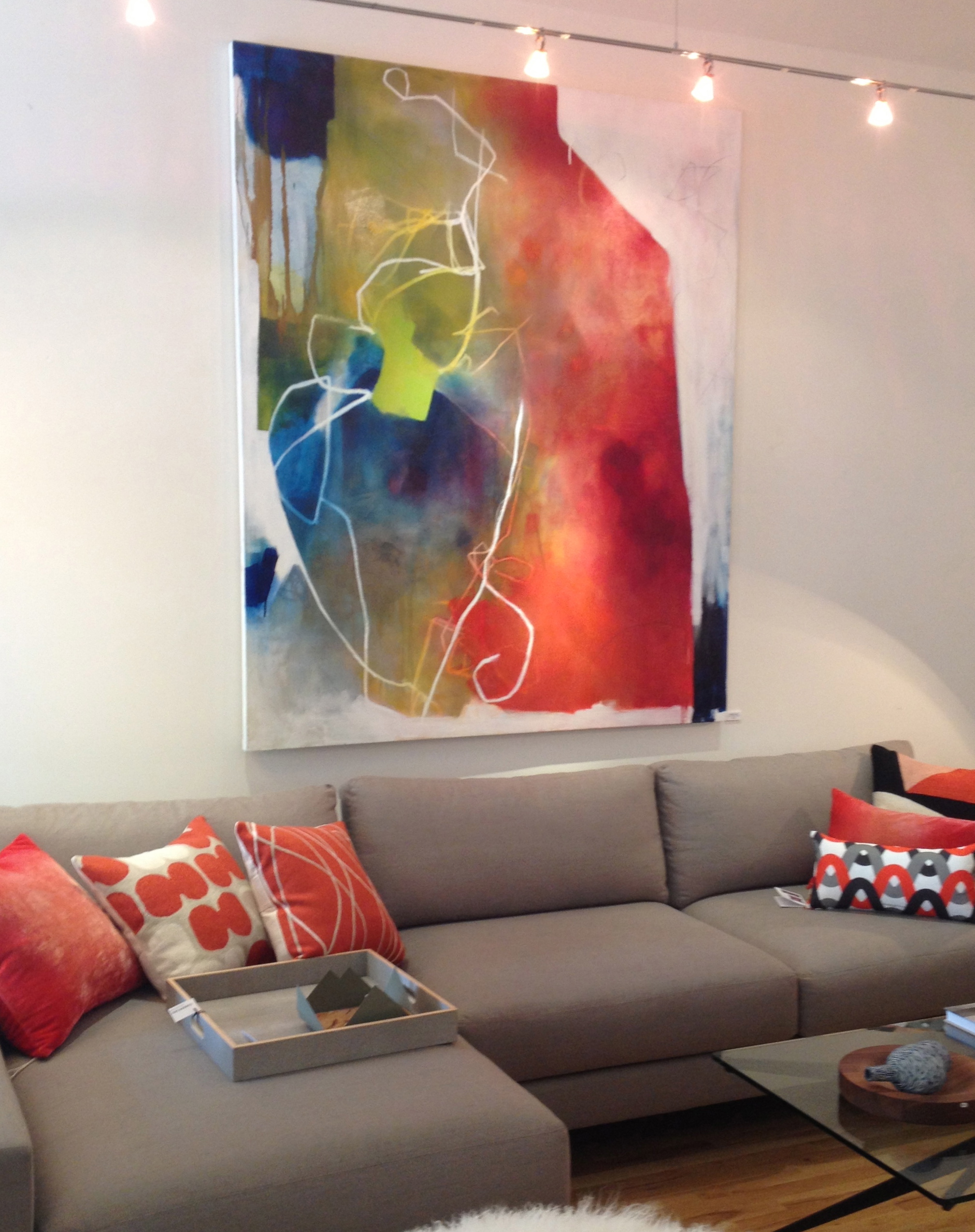
Xanda McCagg's abstract painting, Vast, captures the fun and the energy of this spectrum of warm colors.

Thinking about the different meanings of hot summer days...I can say for me, I love the warmth of the sun, the sound of the ocean and the feel of the sand. Artwork allows us to reflect on a feeling or a sense of place. The colors of these pieces - yellows, oranges and reds convey and take us to the warmth and energy of summer.

There are a few weeks left for us all to enjoy...

Comerford Collection // Art & Artful Home Furnishings

Each season I look forward to my first visit to Comerford Collection, a home furnishings store with a distinctive modern perspective in Bridgehampton, NY.  Owner Karen Comerford has created a shop  based on her refined design aesthetic with a series of vignettes throughout the store that are a visual treat. I love to see what’s new and how Comerford has mixed in Xanda McCagg’s artworks along with the merchandise from other artists and artisans.

McCagg’s paintings compliment the other art, including paintings, photography and sculpture as well as the rest of the products presented in the warm and inviting environment. On the website, Karen Comerford describes the, “refined space...she works to redefine the term MODERN, stripping it of its implications of austerity and imbuing it with a comfortable, uncomplicated simplicity".  This is the third season that McCagg’s work has been represented and sold in this thoughtfully edited store, the bold color and abstract composition of her paintings suit the warm space.

I talked with Comerford about how the store has evolved from it's start as a source for custom furniture in 1999. With a thriving textile design business and a background in illustration and graphic design, Comerford sought to bring her creative interests together. She headed to the Hamptons and opened a store to feature her own products, and merchandise them with her particular style and vision. Each “tableaux” showcases her discerning eye

Comerford’s store has morphed over the years, she has stayed in tune with and responsive to her customers, responded to economic changes and design directions. What has remained consistent is her vision of presenting finely designed and highly crafted products to suit her Hamptons clientele. A clientele that looks to furnish and accessorize their local homes as well as homes in Manhattan and elsewhere.

The core business remains private label furniture, but they have evolved into a full-service furnishings store. Products have expanded into an array of modern & hand-crafted home accessories, glassware, barware and serving pieces for entertaining as well an eclectic assortment of hand-crafted jewelry

Comerford's background is evident in the array of textile products. Accessories range from assorted decorative pillows, including a selection of graphic hand embroidered ones from Judy Ross Textiles

to assorted throws

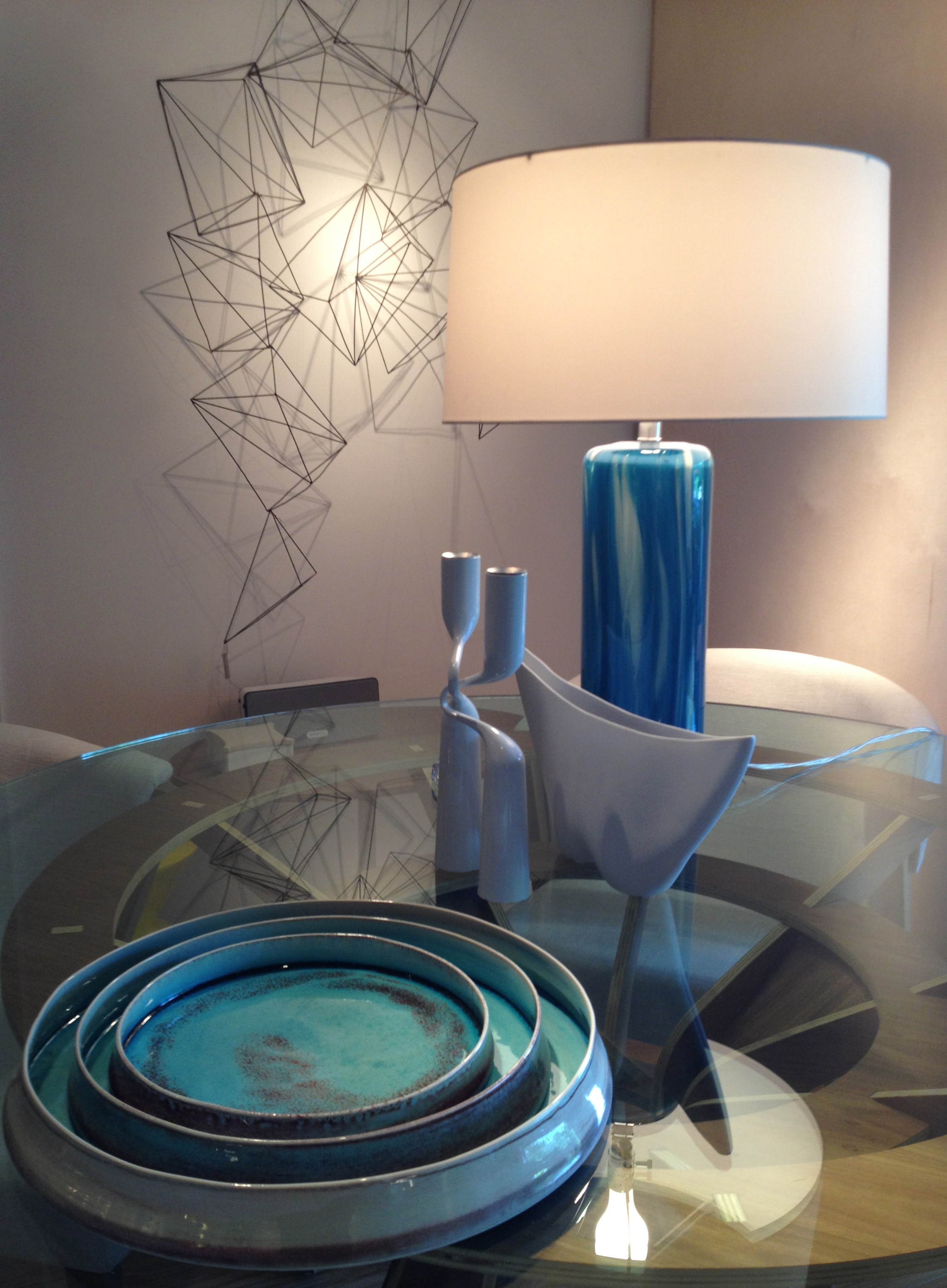
to hand-blown glassware, and lighting

ceramics

and hand-crafted textiles from Columbia (the proceeds of these sales support women's micro-business development) round out the brightly-colored seasonal lacquer trays

and marquetry boxes

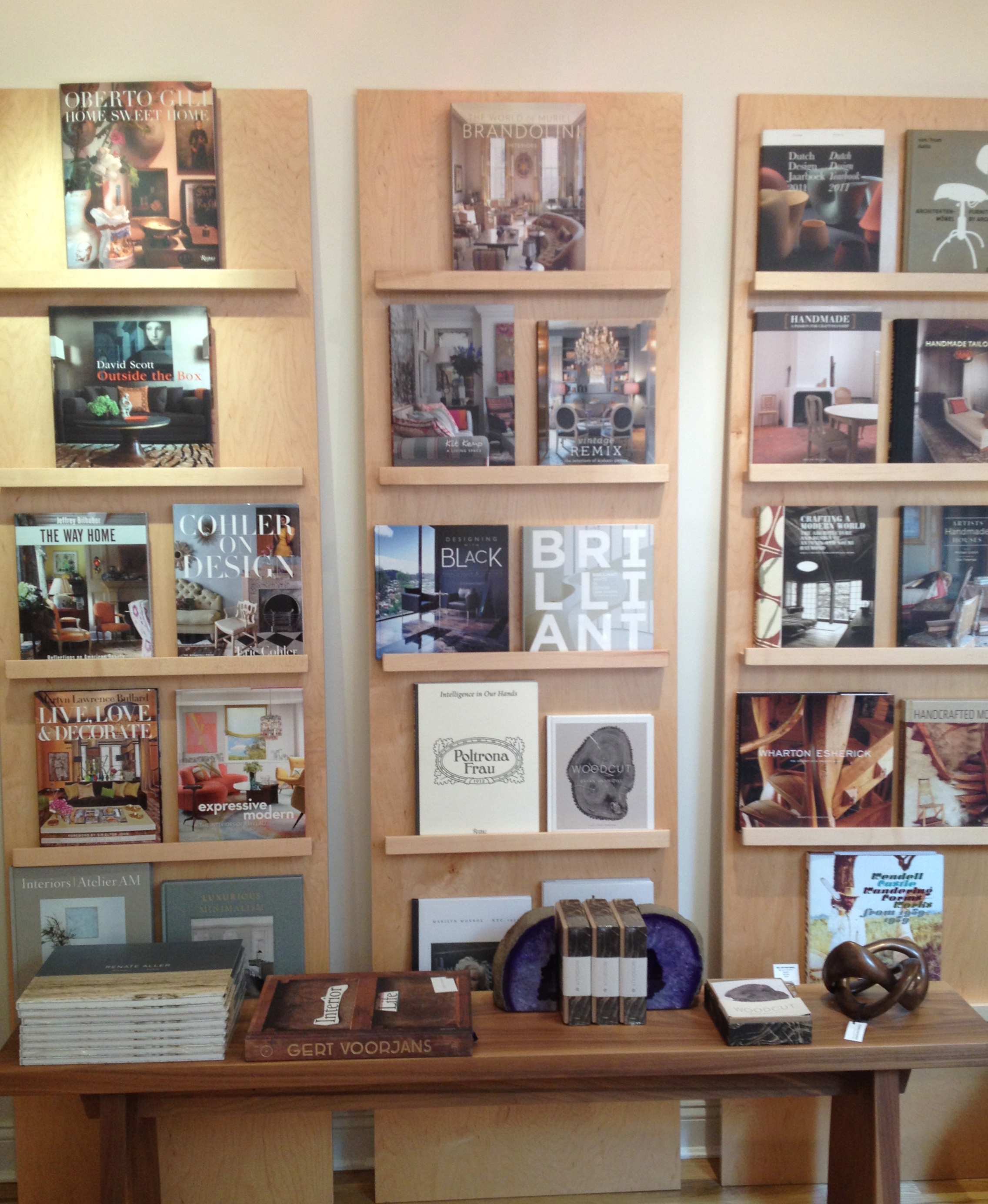
to several walls of art and design books to satisfy all creative interests

Art has always played an important role at Comerford Collection, it provides the “soul of the store”, filling the space with color and energy. This provides ideas and food for thought as to how both the merchandise and the art work together to create liveable and relatable spaces.  McCagg’s work with “both it’s lyrical and bold elements” balance the clean lines of the merchandise. From McCagg’s small, intimate paintings

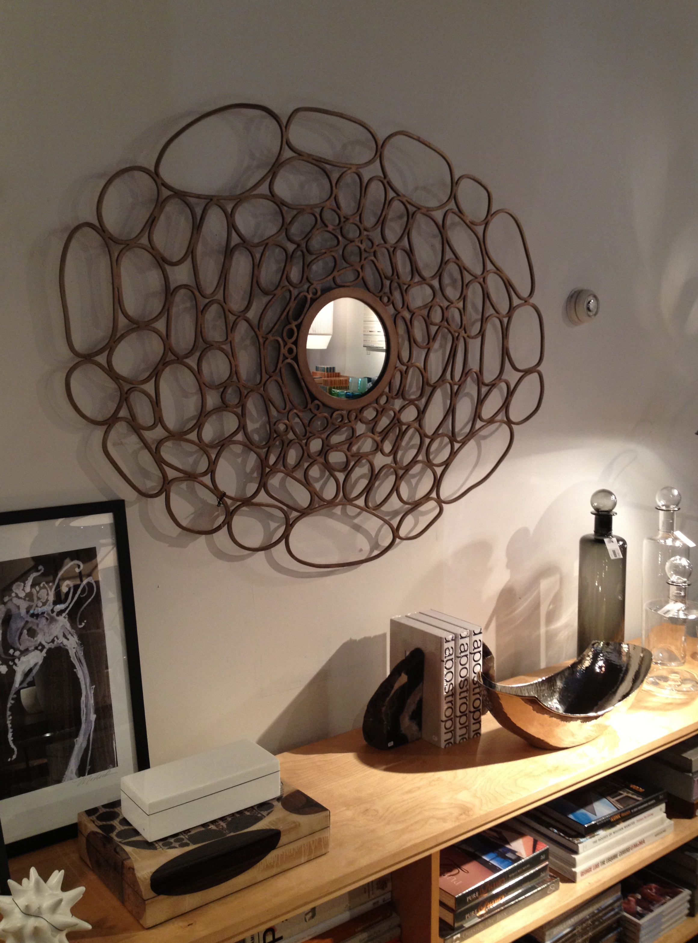
to the stronger, colorful statement pieces. Comerford works with her artists and artisans to customize pieces that are unique to her store. I like that there is a familiarity when I walk back in each season, but I love that there is a fresh feel, pieces that Comerford works hard to source, whether from one of her regular resources or something new she discovers on her travels - like this circular bronze LED light from Paris.

I have always felt that seeing artwork in a home furnishing store is a terrific and logical way to see art in context, a clear presentation of how it would look in a customer’s home. Karen Comerford has created a shop that always inspires, the shop is visually interesting with lots of great options to consider - whether shopping for art, furniture, jewelry or lighting - its always enticing!

GREEN // The Color of Spring

In New York, it's trying very hard to be spring, it feels like it's taking a long time to warm up and change seasons.  In my last post I talked about organ donation, at the same time I sent an eblast with various artworks that to me, represent spring. Green is the color that symbolizes spring.

I received lots of great comments and compliments about the art I selected to represent spring, so I wanted share some of the artworks and acknowledge the artists. I was drawn to nature when thinking about spring, and when I worked with my good friend and graphic designer, Sandy Shekel, to edit the images and create the layout, the greener the better...and there's a reason. Green symbolizes life, new growth, the environment , ecology, recycling and nature.

The lush foliage in COBAMONG BOAT, by Stuart Zaro 

LAUGHTER, by Elena Lyakir

It also represents tranquility, health and luck. We used it for the Share Life logo, to inspire good health and sharing, through organ donation.

Green is also thought to reduce stress and is recommended for a work environment. I'm not sure I'm ready for a return to green walls, but I would love to look at these paintings,

LINE-ING_12"x12", by Xanda McCagg 

and combined with warm colors that evoke a combination of nature and calm, WATERFALL_60"x48", by Anne Raymond   

Christine Wexler's photograph, THE WAVE,  of 3 boys waiting to surf, captures the warmth and spirit of the spring and summer seasons.

There are other artists that come to mind when I think color, and light and spring. Wolf Kahn creates beautiful paintings that evoke nature. I pinned SPRING GREENS on my Pinterest board recently, and it was 're-pinned' and 'liked' many times.

Photographer Bonnie Edelman captures the extraordinary colors of nature in her SCAPES series.

Color theorist Josef Albers explored the relationship of colors and perception in his series of over 1000  geometric paintings, HOMAGE TO THE SQUARE.  One of his green paintings, SOFT SPOKEN,

We will be seeing a lot more green in 2013 since Emerald green was selected by Pantone as the Color of the Year. Versions of emerald will find its way into many products this year.

The spring RE eblast, with the variety of inspiring green artwork was created and sent in support of National Donate Life Month. Thanks to President Obama for making it official and acknowledged throughout the country. My family and I are involved in a number of events during the month to help raise awareness and the profile of the dire need in New York State and throughout the US to increase the organ donor registry. Romanoff Elements will be donating a portion of sales to the New York Organ Donor Network and their work on behalf of increasing the donor registry.

I'm hoping that the sun starts to shine more, and we can all enjoy spring;  the warmth, the natural and beautiful colors, and the new energy that comes with it!

Armory Arts Week - Part 1 // The Armory Show

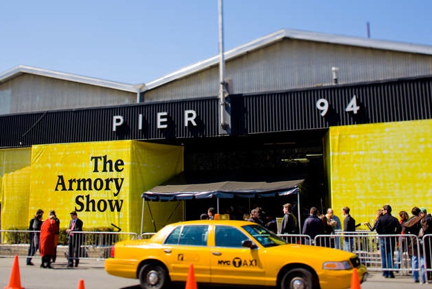
The Armory Show celebrated its 100th year this month. The first show was held in NYC at the 69th Regiment Armory on Lexington Ave. It has grown into a week-long, city-wide arts event, Armory Arts Week, with a multitude of events throughout the city. The city hosts exhibitors, galleries, art dealers and buyers from around the world.

Each Manhattan-based event has a different focus. The Park Avenue Armory exhibits "blue-chip" art, the high end of the art spectrum from exclusive dealers worldwide. Additional venues in the city host international fairs like SCOPE and VOLTA. The Armory holds the Fountain Fair, museums host events through the week, as well as neighborhood fairs, the Independent Art Fair in Chelsea and others in Brooklyn and Soho that showcase the local arts scene.

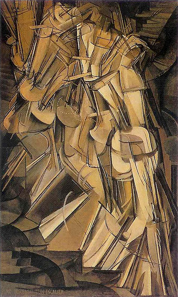
The "Armory Show" itself moved to the Piers in 2001 and the focus is on Contemporary Art by living artists and Modern Art by historically significant artists. There was a mix of genres, countries and artists of all ages.The initial show 100 years ago caused an outrage, President Teddy Roosevelt said, "That's not art!"  in response to the exhibit of works by the new Modern artists, Duchamp, Cezanne, Matisse and more.

We hear the same thing  today as we walk through museums and art fairs -  especially when looking at today's newer genre, Conceptual Art. Here, one of Ai Weiwei's Bicycle sculptures.  The controversial Chinese artist's work is a commentary on the country's ubiquitous form a transportation.

Many contemporary artists are working with technology creating digital installations and video art as they explore , comment and reflect on the use and effects of technology in today's world.

NYC's Bryce Wolkowitz gallery showed South Korean artist Airan Kang’s Luminous Words. I have seen full exhibits of her terrific works, which are a continuing exploration of books as a source of knowledge in the digital age. You can select a few books to your existing bookshelf,

or choose to install a full digital library!

In "Dinner for Two", NY-based artist Rachel Lee Hovnanian is exploring “the blurring of reality and the narcissistic side of digital life”, at Leila Heller Gallery's booth. She comments on communication, and how it's changing, using video screens as a replacement for real-life interactions and communications.

There was art reflecting an interest in text and the written word. Mel Bochner  has been using text in his work since the 70’s. His well  known Blah Blah, Blah


and a grouping of smaller pieces

Another approach to the use of words as imagery is from Rob Wynne, who uses poured glass, creating wall sculptures, either graphic

or using words, often of iconic sayings

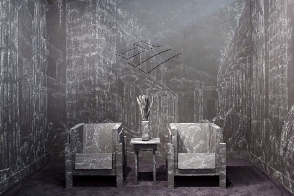
The Morgan Lehman booth was transformed by Kysa Johnson's installation. She recreated a Bank of America waiting room with blackboard paint covered in chalk drawings. At first glance the work is decorative, yet the imagery depicts the decay of Roman ruins based on an artist’s 18th century work. Johnson's work usually has either historical or scientific reference. Interior designer Bryant Keller was at the booth and told us about the smaller home installations he commissioned Johnson to do for his clients. I'm looking forward to seeing photos of the projects.

a detail of the intricate drawing

It's a busy, dizzying scene walking through the Piers - taking in the art, people watching and listening to assorted languages.

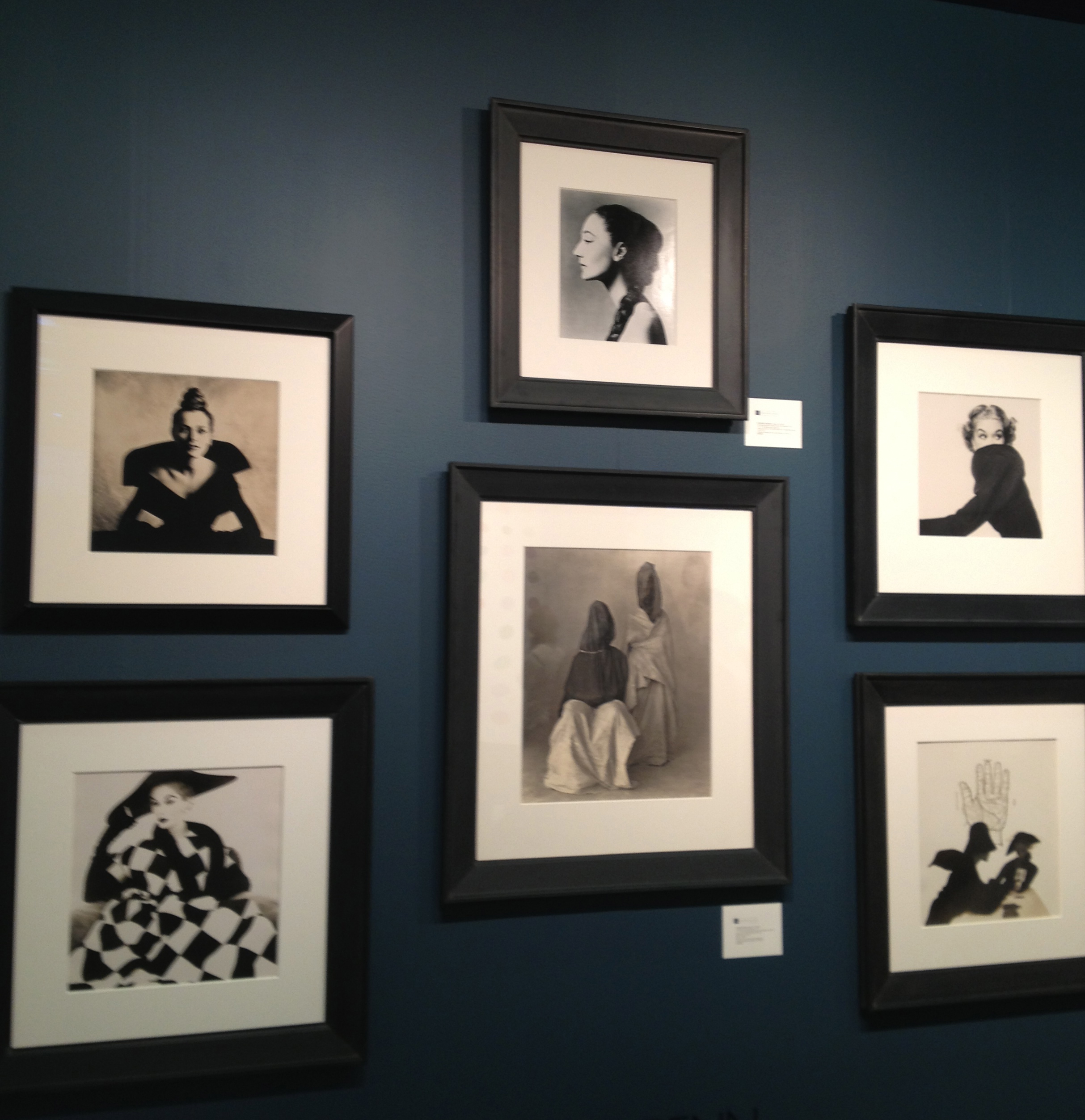
Enjoying Modern favorites, like Irving Penn's iconic fashion photographs

to seeing new artists, like South Korean artist Jung Lee , who places neon phrases within her deserted landscapes

The art fairs were well attended this year and the reviews were favorable. Each year there are more events through the city, which can be overwhelming as you try to tactically plan to take in as much as possible. I managed to visit several fairs and spent a day walking through Chelsea galleries, (more in my next post, Part 2).  A century later, as the Armory Fair is celebrating 100 years, seeing the new best thing in art is still a much-discussed, love-it or hate-it spectacle!

Ensembles // The Beauty of the Barnes Foundation

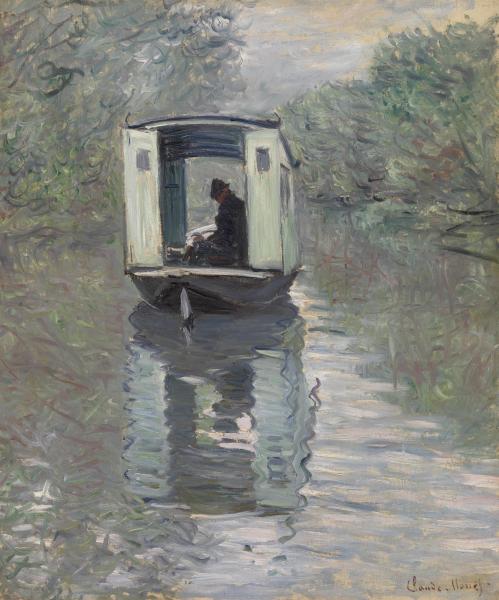
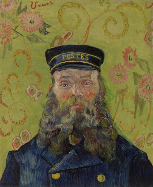
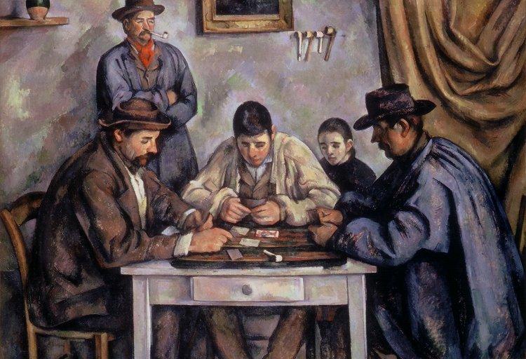
Albert C. Barnes' remarkable and extensive 25 billion dollar collection of over 800 Post-Modern and Impressionist Paintings was moved to a new home last year. My husband and I visited recently while in Philadelphia. Seeing the many rooms of "ensembles”, the compositions that Barnes created, containing the legendary collection of paintings by Masters of the 20th century; Picasso, Degas, Monet, Renoir, van Gogh, Matisse, Modigliani and more, was overwhelming and totally engaging.

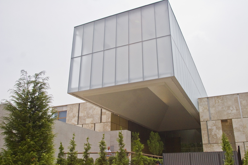
We learned of Barnes' (1872-1951) own education in art and then desire to share his collection as an aid in education. Also, interesting to learn of the controversy surrounding the future of the collection and it's 2012  move from it's original home in suburban Merion, PA. to it's new urban home, the modern "campus", which was designed by architects Tod Williams and Billie Tsien.

Barnes grew up very poor, became a doctor and went on to achieve professional success after developing the chemical Argyrol, used to prevent infant blindness in the 1920's.  He nurtured an interest in art and began collecting, initially having his high school friend, painter William Glackens buy for him in Paris. This was in 1913, while Glackens was planning the first Armory Show (the show opening this week in NY will celebrate 100 years). His first acquisition was 33 Picassos!

Barnes began traveling frequently to purchase more work from the early modernists, Picasso, Matisse , Cezanne and others. Considered an eccentric, his interest in the new modern direction in art dovetailed with his progressive analytical and scientific thinking. His acquisitions began with fine art, but grew to include industrial and decorative arts.

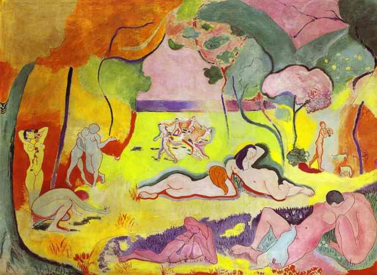
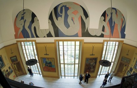
Barnes began formulating his theory, along with philosopher John Dewey and others about how people looked at and learned from art.  The Art in Painting, was the first and most important of his many published writings of his theories.  The Barnes Foundation was created in 1922 as a school rather than a museum, for the purpose of "promoting the advancement of education and the appreciation of the fine arts."  He commissioned Henri Matisse to design a mural for the new building in 1933, The Dance ,which is shown here installed in the new building.

On the day we visited, the museum was filled with young elementary students and we learned of the many academic programs offered. The goal was always focused on education, to teach people how to look at art and think about it critically. From the start Barnes initiated early education programs. He stipulated that the collection would always be used to educate and part of his terms was to limit public access to provide ample time for students. This was a part of the controversy, as the museum began to struggle financially they needed to institute more programs for financial growth.

Barnes arranged his collection in "ensembles", his very personal compositions based on formal principles of light, color, line and space, as opposed to typical displays based on type of work and chronology. His biographers talk about how he constantly moved the work about , always seeking balance and symmetry.

Another controversial point of the move was his wish that the work always be shown exactly as he placed it. The rooms in the new building were built to house the ensembles as he originally hung them and arranged them over 26 years. The architects worked to create a modern spacious environment, while incorporating these small traditional spaces for viewing.

The spacious modern entry and beautiful doors to the galleries are a contrast to the smaller exhibition rooms We listened to a docent describe the color and weight balance of a Goya on one wall and a Renoir on the opposite wall, she explained how Barnes saw the contrast as a compliment, that enhanced the appreciation of each painting. Each exhibition rooms four walls are filled from top to bottom with incredible artworks, almost too much to see in one viewing. We are accustomed to focusing on single artworks as they are usually hung, this forces the eye to look differently, part of Barnes’  idiosyncratic approach.

Barnes amassed the enormous collection between 1912 and 1951. It  contains 2500 objects. He began with paintings by European and American Impressionist and Post-Impressionists, early Modern Masters, then expanded into African sculpture, Native American textiles, metalwork and more.

His interests spanned from his medical and scientific roots to business, philosophy and art and the interrelationship of them all.  He worked tirelessly to bring art education to local students. He didn't care to address the elite and those who had access to art, but rather to those who did not have exposure. He developed a collaboration with Lincoln University after being initially shunned by his alma mater, University of Pennsylvania - which eventually joined him in a program.

Upon his death, Mr. Barnes stipulated the conditions of his collection; he wanted the work to be shown in their original ensembles and to remain in Merion, along with the horticultural arboretum developed by his wife, Laura Legget. Financial instability led the collection to rethink it's future.  A prolonged two year battle ensued about its future, resulting in a change of course as well as leadership. The drawn-out legal battle was depicted in a documentary called The Art of the Steal,  which claimed that the move was a kind of "cultural heist". This issue that has recently been confronted by various institutions as they work to stay fiscally sound, as well as true to the terms of it's donors and endowment.

I haven't visited the original building, nor did I know much about the issues surrounding the Foundation's move. We enjoyed our visit, primarily because it is a remarkable collection, and the permanent exhibit, provides insight into a visionary thinker and how he came to amass a collection valued at 25 billion dollars (thought to be a low estimate given recent auction sales). I read about the issues and controversy afterwards. Seems to me that the decisions that led the Foundation to their new home has had a good outcome. It would be unfortunate if this incredible collection wasn't accessible to be seen or used as an educational tool for as many as possible -  it seems in keeping with Albert Barnes' early vision."Living with and studying good paintings offers greater interest, variety and satisfaction than any other pleasure known to man." - Dr. Albert C. Barnes


Color // The Power of Red

Red is an emotional color. It elicits feelings, both positive and negative, depending upon its context. Last year, I wrote a blog in February about the color red in art & design and why it has become associated with Valentine's Day. When I began thinking about it recently and if and how I might add to this, I found red was present in many places other than art. It prompted me to think about what else elicits emotion. Abstract Expressionist Mark Rothko's "No.1 (Royal Red & Blue)" sold in November 2012 for $75 million at a record-setting Sotheby's contemporary art auction. The NY Times reported that as the bidding was escalating, the dealers described this painting as having "wall power" - as in, it is large, and has presence, a result of the strong color and composition, and thus fetched a significant price.

Leatrice Eiseman, a color specialist, is an "international color guru". She works with color consultant Pantone, and with companies worldwide offering advice on how color can affect their brands. Eiseman says, "People love red".  In her book, "Colors for Your Every Mood", she writes that red evokes a physiological reaction. And since it is believed to promote passion, it's an obvious choice for the bedroom. Red is perceived as the most sensual of all colors and, as the saying goes, 'sex sells.'

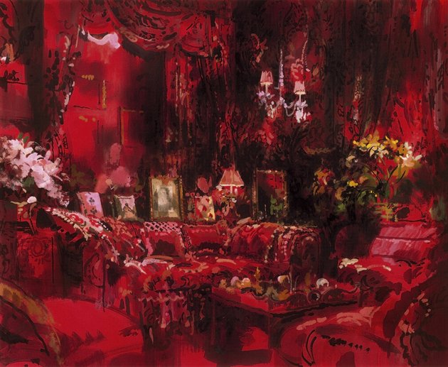
Diana Vreeland, the larger than life fashion editor of Harpers Bazaar, Vogue and then Creative Consultant to the Costume Institute at the Metropolitan Museum said, "Red is the great clarifier - bright, cleansing, revealing. It makes all colors beautiful. I can't imagine being bored with it ... I wanted this apartment to be a garden - but it had to be a garden in hell."

Vreeland in her  multi-patterned living room, with layers of red,  her "garden of hell",  photographed by Horst P. Horst

Editor Pamela Fiori recently wrote in Harper's Bazaar about Richard Avedon and his muse, Audrey Hepburn. This photo was one of his many photographs during his collaboration with Vreeland.
 

The passion of red extends to other fields, including sports...and this was very apparent to me recently. At a Super Bowl party last week, a kitchen conversation, away from the TV's and the game, turned to politics, Michelle Obama and her fashion choices. There was a sharp divide on the subject of the Jason Wu flowing red organza gown she wore to the Inaugural Balls. Was it a good color for her, was it too strong, was it elegant, did she look better in white four years ago?  My opinion: I thought she looked beautiful and regal in red!

And then the sports teams themselves. This past week with football season over, my family turned its focus to Big Ten college basketball. I began to notice the red and white uniforms. First, of the Indiana Hoosiers (my son's team, so a family favorite!) then, the Wisconsin Badgers and Ohio State Buckeyes. Really, once you start looking, there's a long list of teams with red in their uniforms, from college to the pros.

National Geographic reported a study by anthropologists on the power and benefits of red in sports. It stated that, "when opponents of a game are equally matched, the team dressed in red is more likely to win."  It went on, "Across a range of sports, we find that wearing red is consistently associated with a higher probability of winning."  The feeling is that there is an intuitive, but not conscious, aspect to seeing the benefits of the strong color.

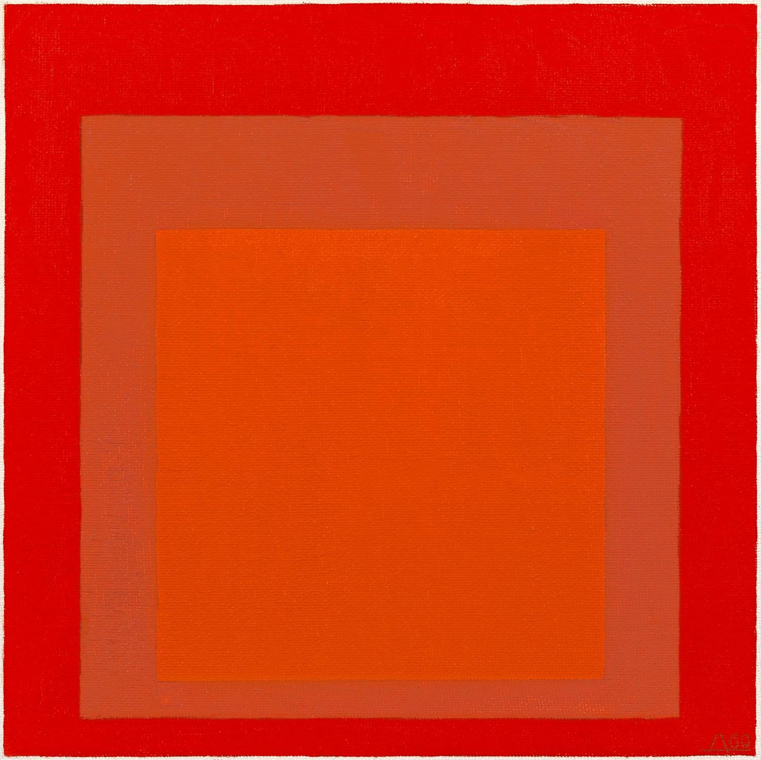
In art, color theorist Josef Albers series, Homage to the Square, he explored chromatic interaction of nesting squares. One of  his red studies

I'm a fan of the strong canvases of several artists that I work with;

Attraction, by Xanda McCagg - with an evocative name

Random Red, by  Andrea Bonfils - created with layers of encaustic wax

Cirrus Cadmium ll, by Anne Raymond - named for the red pigment

In interiors, color is used sparingly as an accent or in large doses to fill the room. Designer Jennifer Post, known for her minimalist interiors, often punctuates a space with bright color

Architectural Digest recently featured the LA home of Maroon 5's Adam Levine, beautifully filled with an art collection and mid-century furnishings. Designer Mark Haddaway used a combination of reds, from the deep rich hue of the drapes, to the pattern of the rug to accent the masculine bedroom. The oversized bright red tufted red ottoman is the visual centerpiece

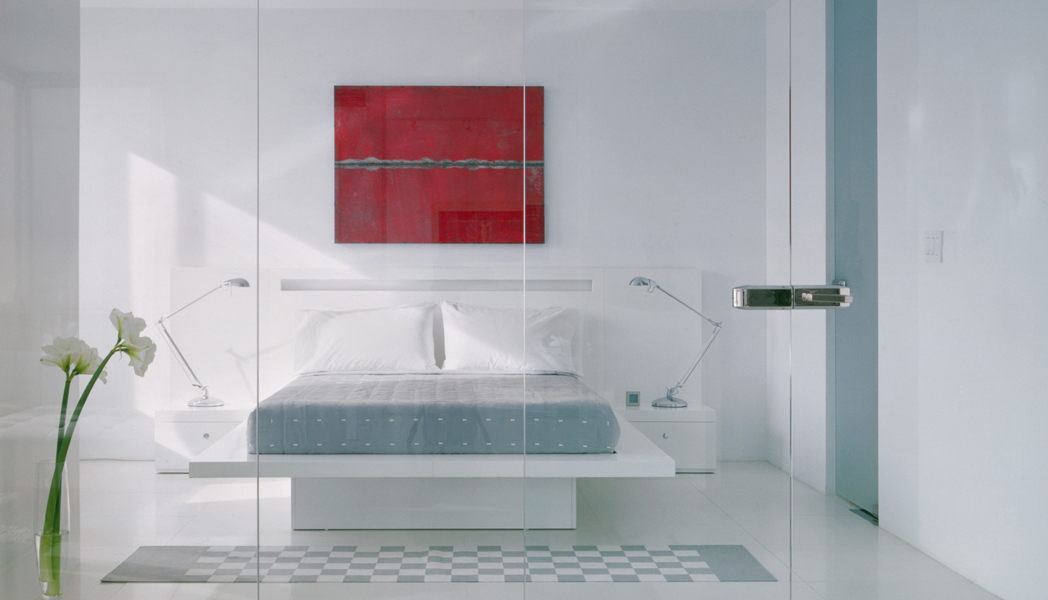
Miles Redd is known for his bold use of color and often chooses red, either saturating a room in the color or in small doses of red as in this fun closet.

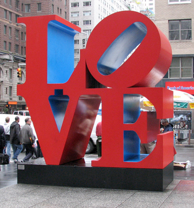
Robert Indiana's LOVE sculpture was initially created as a holiday card for the Museum of Modern Art. The design then became a sculpture exhibited at the Indiana Museum of Art.  It has since been recreated around the world, it became a postage stamp and an iconic pop art symbol.

As a color identified with emotion and love, red has long been associated with Valentine's Day. I found it so interesting when I began to focus on the color red, I realized it was all around me: from the First Lady to fashion to interior design to art, to sports uniforms. Totally different applications, but in each, the color red, elicits emotion.

Artful Options // at the NY Gift Show

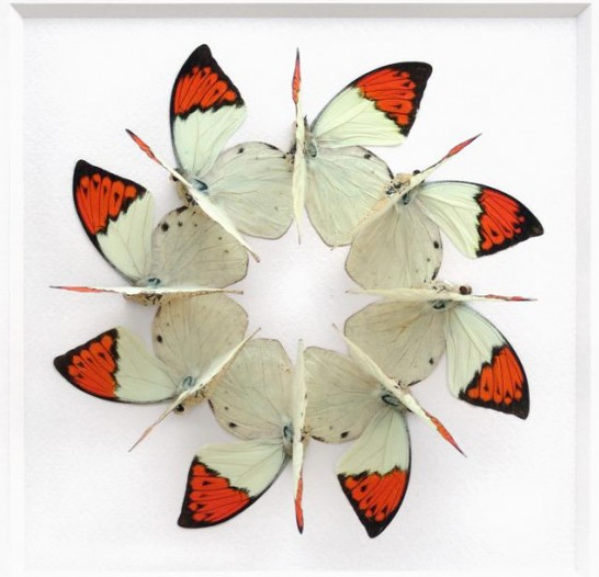
The NYIGF, the “gift show” is in NYC twice a year, filling two piers and the Jacob Javits center with merchandise. 35,0000 buyers from the US and 85 countries shop for new products in home decor, tabletop, personal accessories, kids, books & more. I’ve been attending for a number of years and look forward to catching up on what's new for the  home, particularly decorative accessories, art and artisanal products. I want to share some notable decorative art that I saw last week. For the past 15 years, Christopher Marley has been creating modern artworks from natural objects at Pheromones. His love of nature and the beauty of living and found things led him to create precise geometric artworks with these elements.

He incorporates insects, butterflies, fossils, crystals, shells & feathers into beautiful decorative pieces. His work has a geometric precision and creates visual impact on two levels, on one you have the overall shape crafted by his attention to spatial relationships, line and form.

And then you have the element itself, the insect or crystal or butterfly and its inherent beauty. Marley considers himself a storyteller because he takes the single object and crafts something bigger with his overall composition.

A favorite resource of mine for artisanal furnishings is Moderna, which features contemporary Brazilian furnishings. Roberta Schilling puts together a collection of modern furniture that represents the countries’ strong history of craftsmanship. Always supplemented with beautiful glass and ceramic pieces, this show also featured a number of terrific and different art pieces as well.

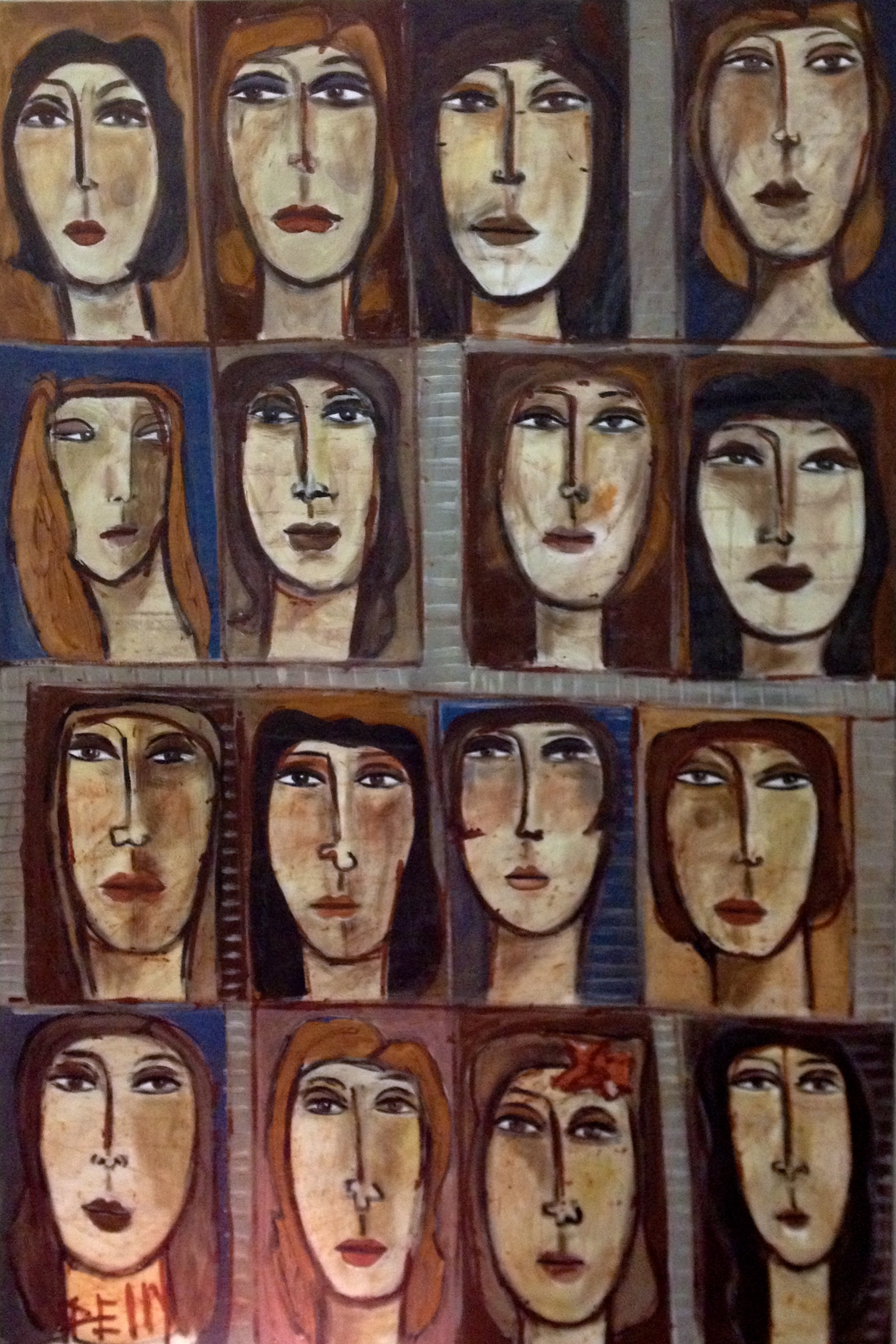
These colorful portrait paintings have great color and raw energy

A graphic collection of 20" x 20" glass squares with linear patterns creates an optical illusion, which varies depending upon the placement of the graphic works.

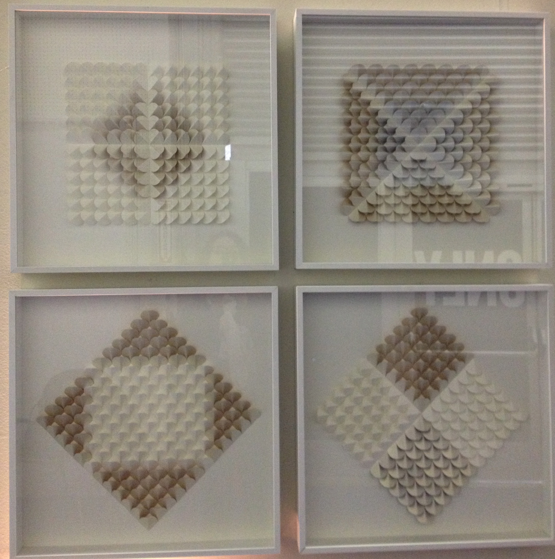
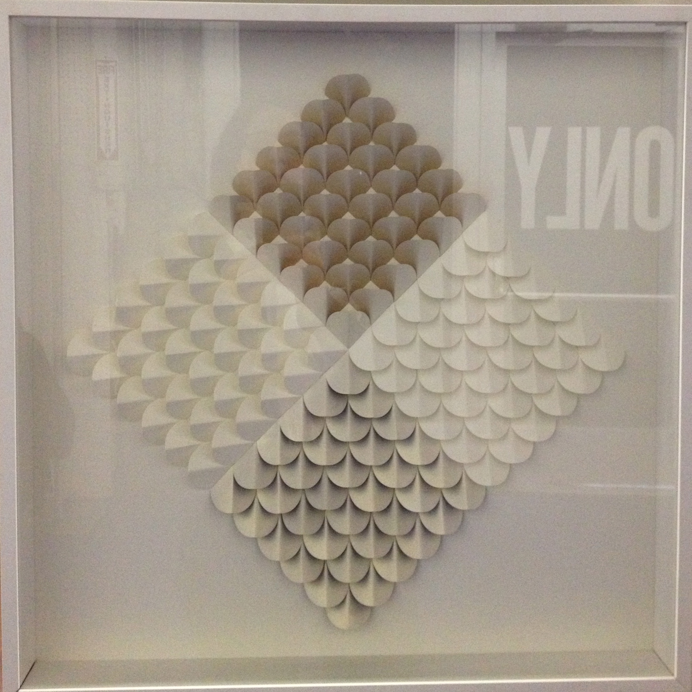
I especially liked this grouping of two-dimensional sculptural pieces crafted from paper in natural tones of white, grey and taupe.

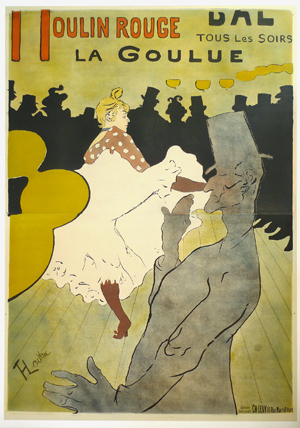
Posters have been used in advertising since the early 1800‘s when printing made mass production possible. The Ross Art Group exhibits their collection of collectible vintage posters which includes many memorable and iconic images.  In the 1850's French artist Henri Toulouse-Lautrec spent a great deal of time portraying the dancers at the Moulin Rouge. For income, Lautrec and other artists were hired to paint posters as advertisements for the shows.

La Goulue, Louise Weber, was the model for many of his artworks, both paintings and posters.

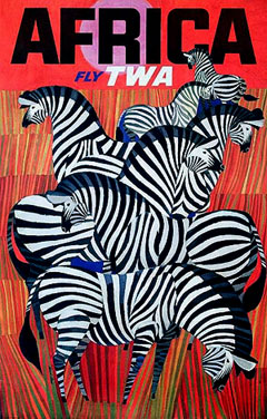
In the 1960's, the Artist David Klein created a group of iconic illustrated  TWA posters . Here are two favorites,


Andy Warhol used his famous “15 minutes” in many ways.  One of which was creating a series of four posters for Chanel in 1997, in different colors.  Warhol's pop paintings of many of the era's consumer products have become iconic images.

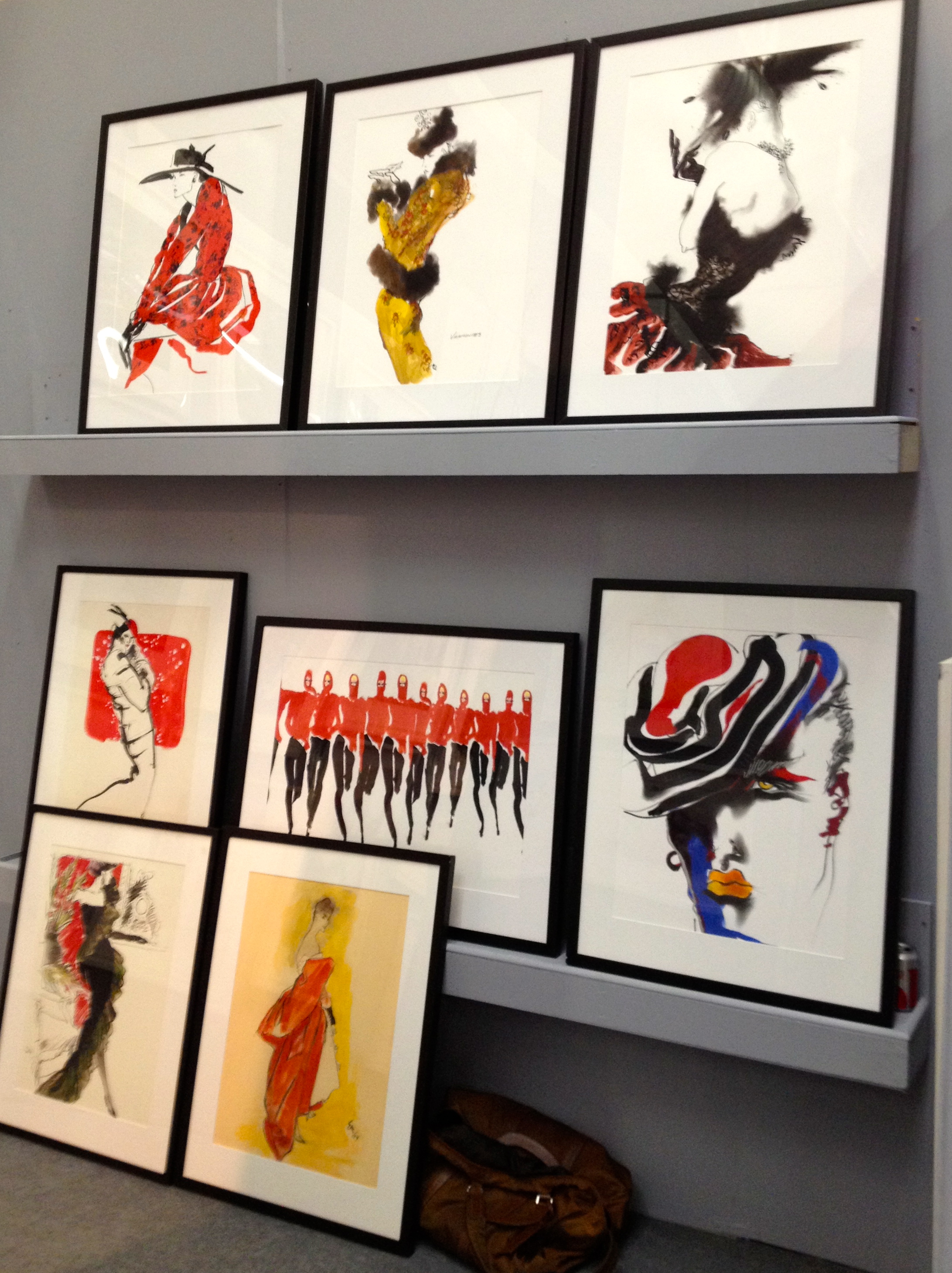
Another reference to fashion and design history is in a collection of prints from Dean Rhys Morgan. The London-based company has created limited edition giclee prints of drawings by various famous illustrators of the 20th century. This is a great way to acknowledge and enjoy beautifully rendered artwork that would otherwise not be seen, work that documents people, fashions, trends and places of the last century.

Tony Viramontes created graphic and vivid illustrations for many designers and magazines through the 70's and 80's. Much of his work captures the mood and energy of those years in fashion and music.

Jeremiah Goodman was an illustrator for Lord & Taylor for many years and was also known for the rooms he illustrated for the monthly covers of Interior Design magazine.

The Diana Vreeland, “Garden of Hell”  living room is wonderful,

and Sir John Gielgud's sitting room,

I highlighted several resources that I saw at the recent New York International Gift Fair (which is being rebranded this year to NY NOW, The Market for Home+Lifestyle, a more suitable name) that reflect an interest in nature and artisanal work as well as historical references in art, fashion & decor. There is a lot of overlap in these creative fields and these artists and companies are presenting products that respect and exemplify this.