Romanoff Elements // Providing Access to Art & Artists

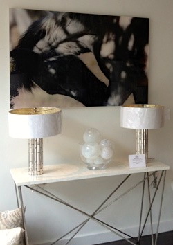
RE works with clients to find art that appropriately reflects them and suits their space. We work with both designers and clients to select art and design elements that work within their budget and are an extension of their taste and the way that they live. Everyone has their unique taste and style, a vision for their home and work environment. There are a number of reasons why they may choose to work with a consultant or designer. Time is a huge factor today. With time limited, days of visiting galleries and shopping in general, is less than it used to be. It's helpful to bring someone in to help realize their particular vision. Mara Solow of Mara Solow Interiors was familiar with Bonnie Edelman's photography after seeing several of RE's exhibitions of Edelman's work . Solow and her client worked with RE to select this abstracted landscape photograph to provide color and contrast in a quiet and serene master bedroom.

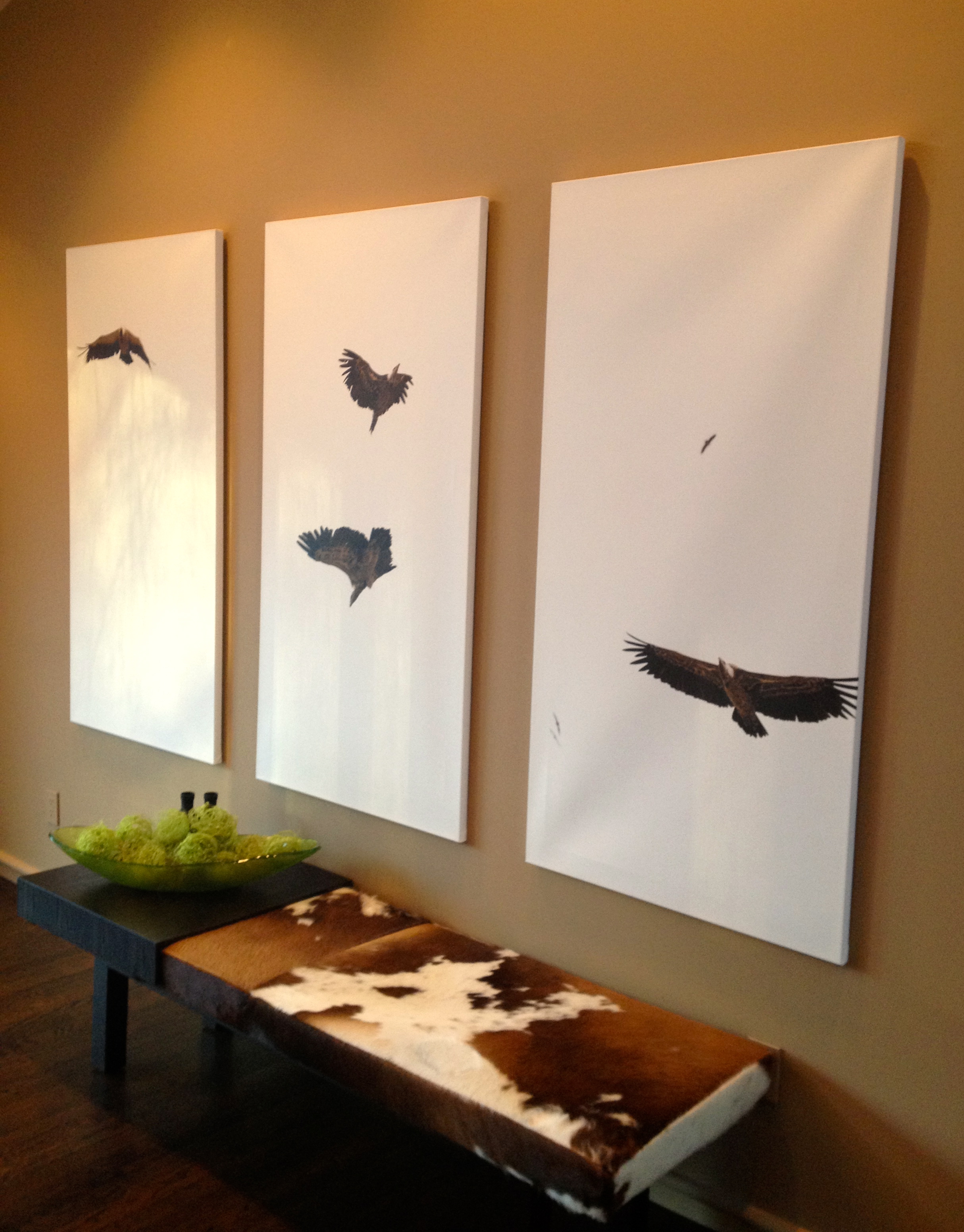
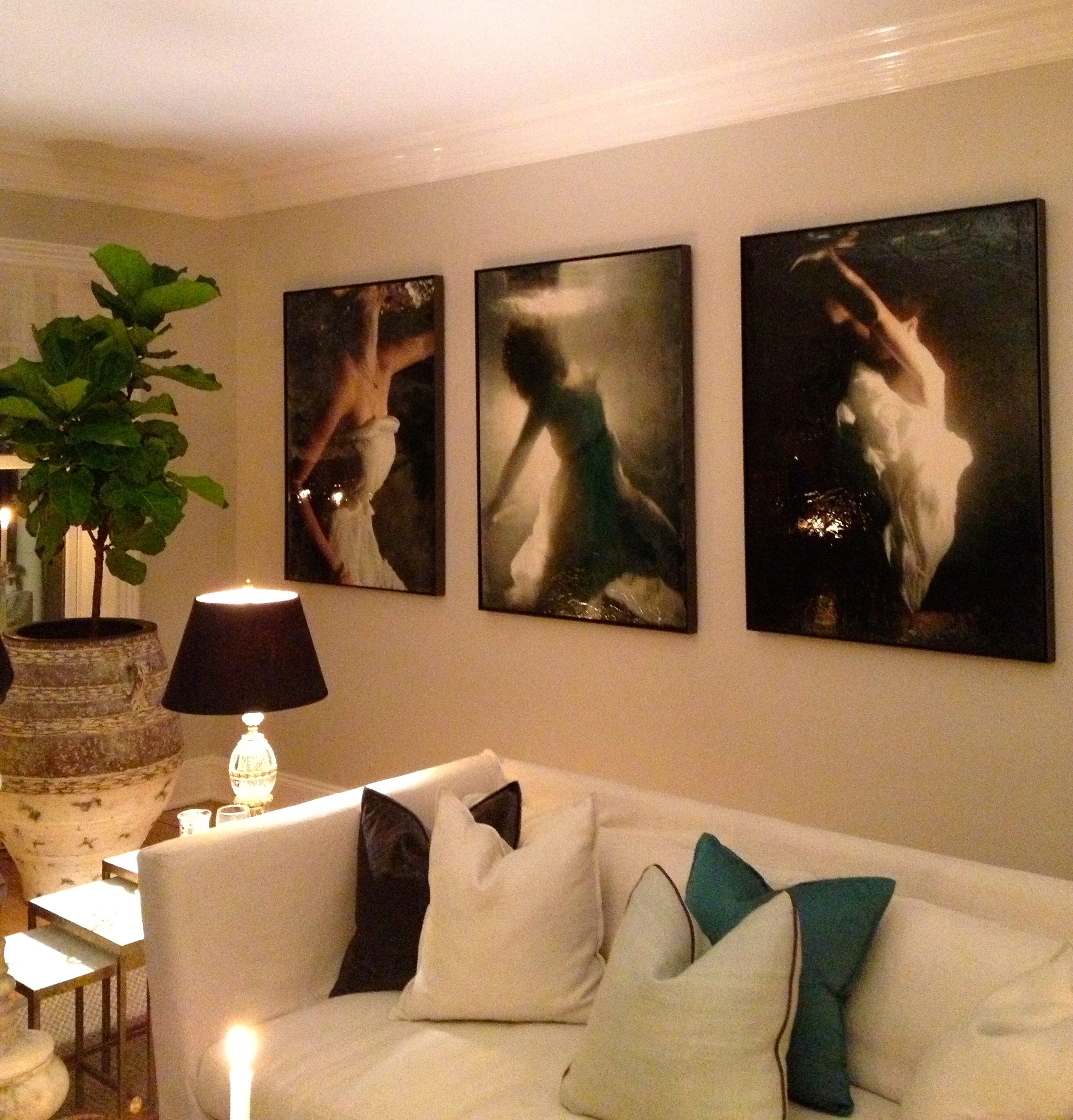
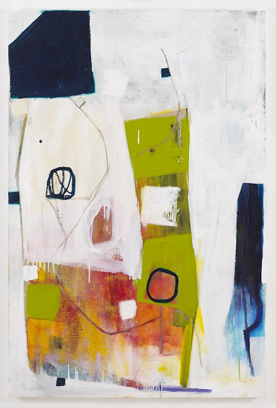
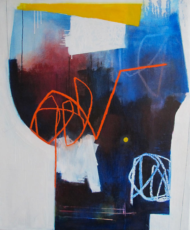
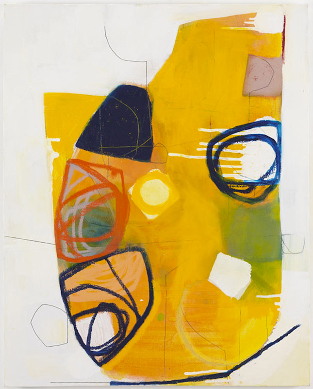
LETT by Heiberg Cummings selected these three mixed media artworks by Andrea Bonfils to compliment the elegant living room and incorporate the long wall into the beautifully designed space. The selection was made after the designer visited  the artist's studio.

It's helpful to look at digital images, and narrow down selections online, but following up with home and office visits provides our clients the option to see the artwork in person, see the colors, textures and experience it in their home or office.

Painting by Anne Raymond in a Hampton's home.

Paintings on paper by Anne Raymond

We also work with home furnishing retailers to provide artwork for customer’s to see in the context of a home decor environment. When shopping for furnishings and accessories, a customer can relate to seeing a painting or fine art photography above a dining table or within a beautiful vignette.

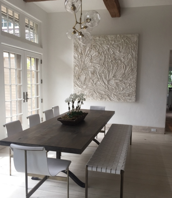
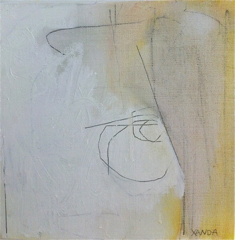
Xanda McCagg's striking abstract canvas provides great color and composition among the artisanal furnishings at Comerford Collection in Bridgehampton.

McCagg's Blue Moment, was recently  featured in Elle Decor in a beautifully designed Hamptons home by Robert Stilins Interiors.

Interior designers work with RE to bring art and artisanal products that are selected specifically with their client's in mind. We come to understand a project and how the art will compliment the design and the rooms and suit the client.

At times a project results in a commission specifically for a client. We are currently working on a site-specific representational landscape painting for a panelled wall. Due to the dimensions and design of the panels in a client's grand foyer, an artist is creating a custom painting based on her work that our client likes.

This horizon image was selected by a client after a long search, to compliment the natural stone wall and running creek in her country home. It looks beautiful and suits the organic environment.

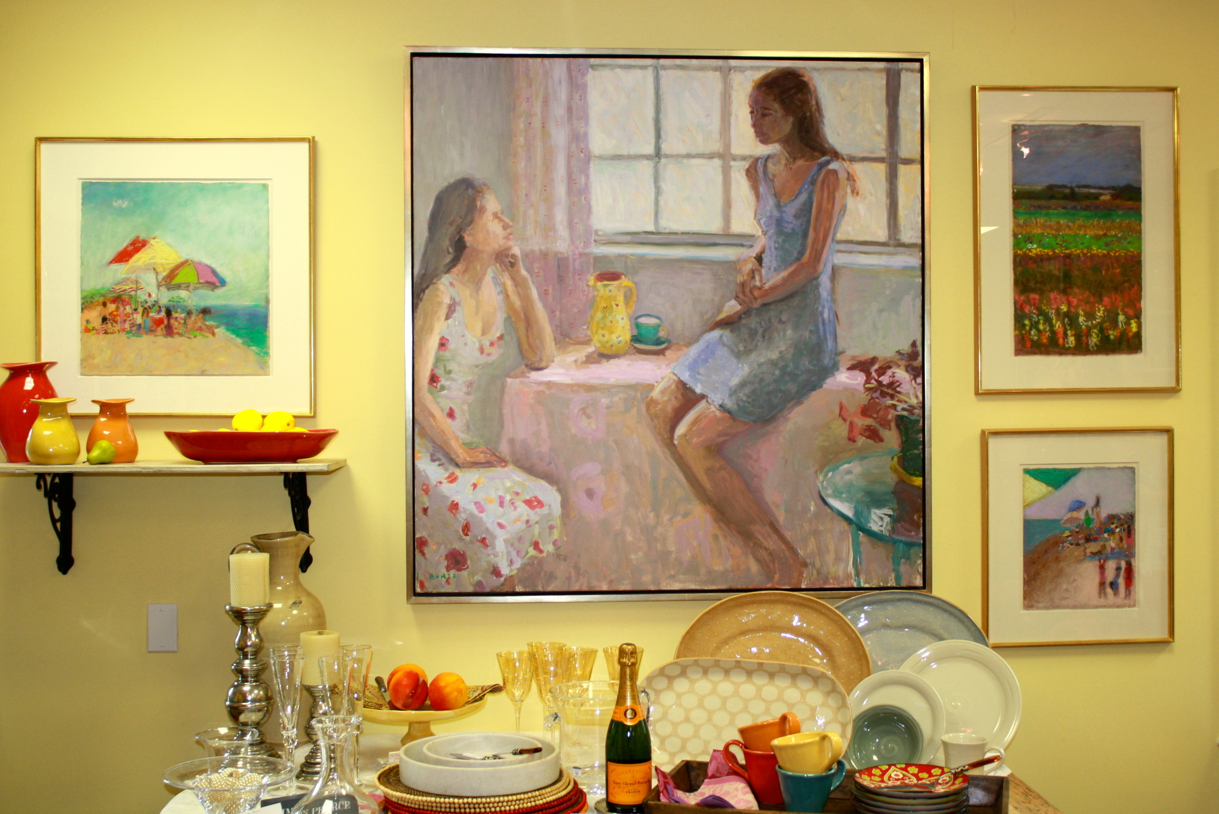
Recently, I have begun working with representational artists, after a number of years with primarily abstract works and fine art photography. Mother and Daughter and seascape pastels by Tracy Burtz were suitable for a Mother's Day event at Table d'Hote, a tabletop and home accessories store in Armonk, NY.

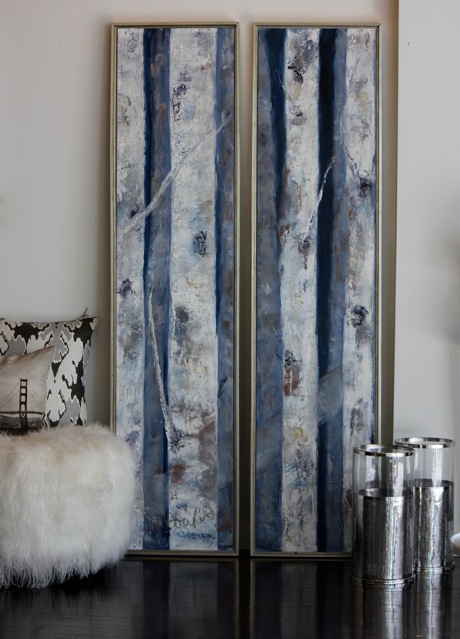
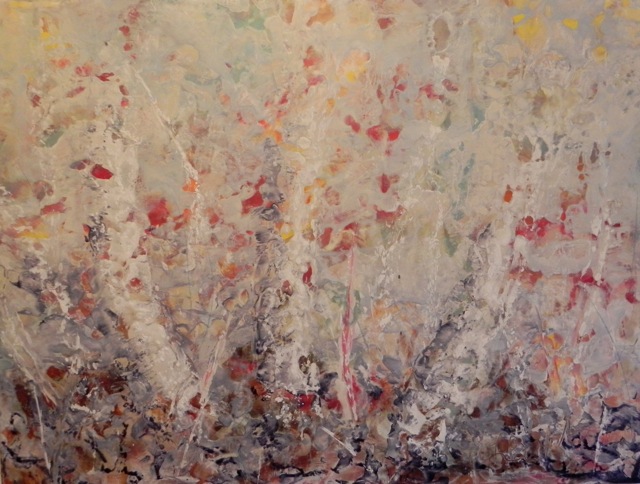
We work to bring in artworks that suit the space, whether it's a home, office or a retailer and their customers. Encaustic mixed media works compliment the classic contemporary home furnishings at Nest Inspired Home in Rye, NY.

Consultants are used to provide access to artists that a client, designer or retailer wouldn’t otherwise have. There are many remarkably talented, creative people producing work that isn't out and visible - isn’t in stores and galleries or online. Some artists show at local or regional art shows, some in galleries - many have developed a group of collectors over the years, both private and corporate, who return periodically to add to their collections.  RE and other consultants spend time finding and learning about many artists and their bodies of work to introduce to their clients.

I have always been surrounded by artists and creatively inspired people.  I enjoy bringing them and their artwork together with those who will love and appreciate their work and enjoy living with it.

Heiberg Cummings Design // Elegant & Koselig (Cozy) Style

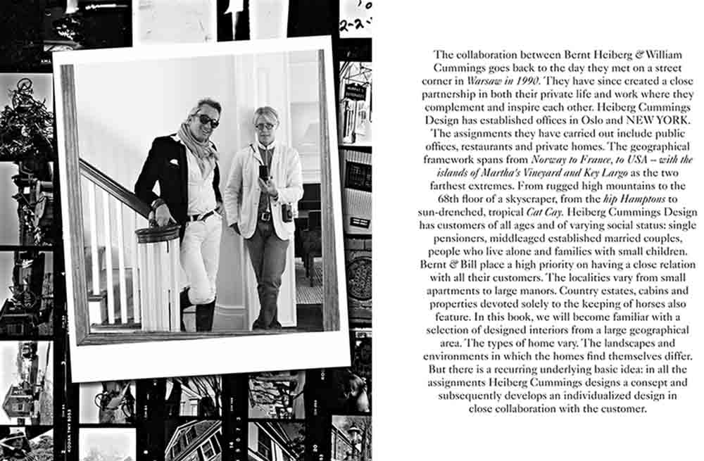
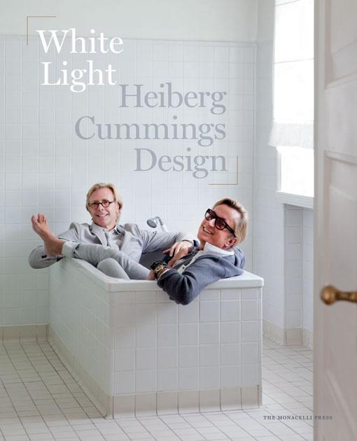
I met Bernt Heiberg and Bill Cummings of Heiberg Cummings Design at an event they hosted for one of their projects in December.  I quickly felt their warmth and style, both from the design partners themselves, and from their interior design work. They describe their aesthetic concept in their recently published book, White Light. It's about "koselig", which "literally translated means cozy in Norway, the word is used to describe everything from a room’s hospitable warmth to the pleasant feeling one gets in running into an old friend."  Koselig, is how Bill described their Chelsea apt. in a magazine article that was featured in their book - and it's how I would describe meeting them and seeing their work. This is their third book,

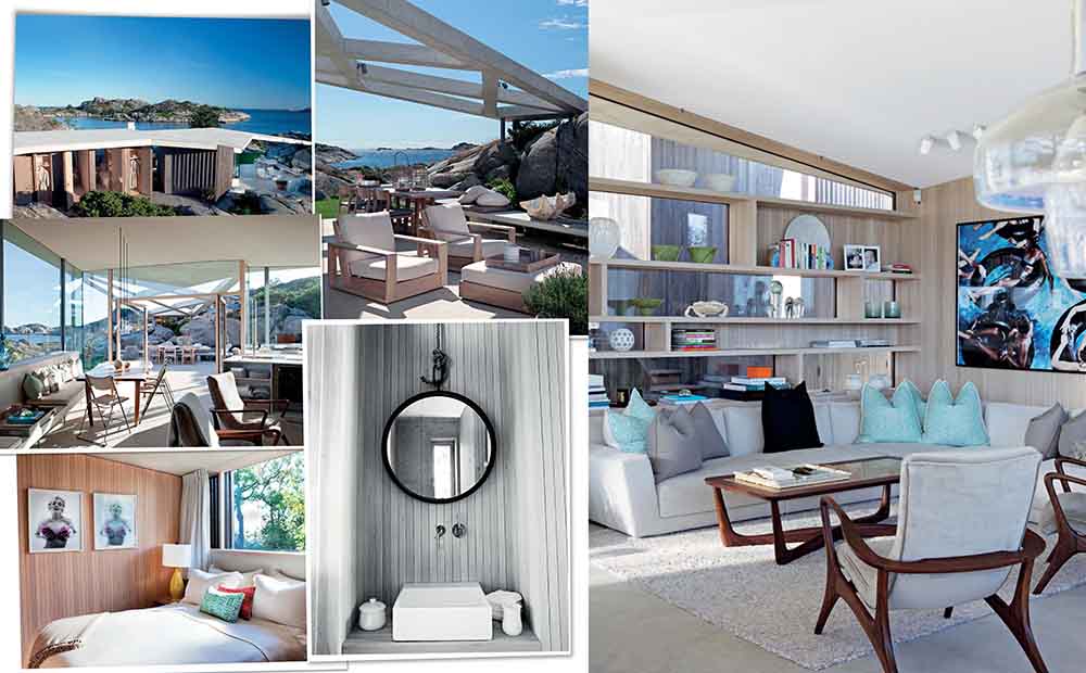
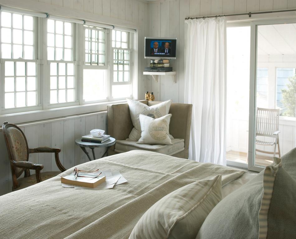
Their interiors are comfortable, and easy

also refined and elegant

The partnership began in 1990 in Oslo doing interiors in Europe and the US. They moved the center of their business to the NYC's West Village, but retain an office in Norway. The duo blend Bernt's Scandinavian minimalism with Bill's artistic and business background with an appreciation for traditional American design. This has come together into a modern design business with clients and residences from Manhattan, the Hamptons, throughout the Northeast, corporate projects to country homes in Norway.

The core of their philosophy and technique is Conceptual Design. Each project starts with a framework, a concept that is driven by the client and their close relationships. They want to understand what a client is looking for, how they live and how to best reflect their family and traditions. The core concept evolves and it then prevails in each space of the home providing the framework for the physical design which follows.

Each project differs in personality, but the foundation is consistent, warm neutral and natural colors and textiles, continuity throughout the project, which comes from the concept. Warm and quiet, yet a recurring description is 'tension', and it varies from project to project. The tension is a surprise, it may be accent colors, art, the antiques and accessories - and this is where each project suitably reflects its owners.

Naima Boger, a designer with the firm sought me out for artwork for a LETT, by Heiberg Cummings project in Rye, NY. LETT, Norwegian for 'Light" was introduced last year to provide another way for Heiberg Cummings to provide their design services and aesthetic to more clients. The LETT team is hired to provide interior design services on a room by room basis. They provide a beautiful boxed presentation containing customized floor plans, drawings, and tear sheets of recommended items. The client receives a shopping list to execute and manage themselves. The design firm will come in to style and accessorize when the client is ready and the furnishings are complete.

Naima worked on the Westchester project and assisted her client in sourcing artwork and accessories. When she saw Andrea Bonfils' Underwater Mixed Media artworks, she knew immediately they would provide the living room with the balance and the contrast to complete the room and compliment the photographs on the opposite wall, by Katie White Photography.

Ophelia, another Bonfils' piece is in the adjacent foyer.

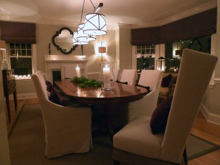
Xanda McCagg's abstract Tete-a-Tete brought tension, color and contrast to the dining room. The strong modern painting is a counterpoint to the traditional furnishings, and the color balances the sofa, pillows and window coverings.

LETT is a timely and exciting new direction for Heiberg Cummings Design. It is a concept that will make their services accessible to many more people and introduce a new direction in interior design. The firm has an international reputation for the quiet, refined and personalized aesthetic they have created. They have a flair for details that reflect the homeowner, whether it's artworks, accessories or incorporating family items that are lived-in and worn. The spaces they design are contemporary  - yet they're classic and comfortable, a style that creates liveable spaces that at the same time are elegant and koselig!

The Neue Galerie // A NYC Gem

An afternoon spent walking through the collections at the Neue Galerie  was a real treat, a glimpse into another era. My daughter Alexis and I had a few hours recently and chose the small collection of Austrian And German Expressionist art in the beautifully restored Beaux Arts mansion just off Fifth Avenue's Museum Mile. The museum showcases early twentieth-century German and Austrian art and design. The collection reflects the intersection of various creative disciplines at the turn of the century, the "New Art", (source of the museum's name) of this period was represented throughout Europe to capture the innovative and modern spirit that was emerging. Examples from these early days of modern design; in the decorative arts, painting, sculpture, furniture, lighting and the very new field of photography are all represented in this thoughtfully edited collection and inspired design and book stores within the museum. The collection has work from the fine artists from Vienna, including Gustav Klimt and Egon Schiele.

and the decorative art of early modernists, such as Wiener Werkstatte and Josef Hoffman.

In the early 1900's in Germany, the Bauhaus movement was growing and included artists like Wassily Kandily and Paul Klee and Ludwig Mies van der Rohe and Marcel Breuer. I have Breuer kitchen chairs based on the same tubular steel design of this bar cart and lounge.

The Neue Galerie grew out of the passions of two men who collected Modern German and Austrian art and design. Leonard Lauder, a businessman,  philanthropist and art collector and Serge Sabarsky, an art dealer and museum exhibition organizer. In 1996, after Sabarsky's death, Lauder began to create the Neue Galerie, to realize their shared vision of opening a museum for their respective collections. He bought  the former William Starr Miller House, on the corner of Fifth Ave and 86 St. Seldorf Architects renovated the mansion to appropriately display their artworks.

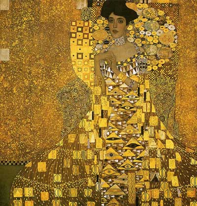
In 2006, Lauder purchased Gustav Klimt's 1907 gold-drenched Portrait of Adele Bloch-Bauer l for a record price (at the time of $135 million).  The painting is in the main floor gallery, it is really wonderful, and worth the visit to the museum.

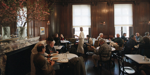
Cafe Sabarsky, the intimate restaurant in the museum was designed to replicate the Viennese cafes at the turn of the century. The furnishings are correct for the period, light fixtures are by Josef Hoffman, furniture by Adolf Loos and the banquettes in a 1912 fabric by Otto Wagner. I began by saying the museum and cafe are a treat, a quiet and lovely space. We didn't eat here that day, but will plan to on our next visit. The museum and cafe are beautifully done, a wonderful break from the usual NY pace, an environment to feel immersed in the period it represents.

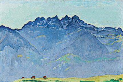
We saw the current exhibit of Ferdinand Hodler's paintings. Hodler is considered the most influential Swiss artist of the period. His landscapes are beautifully executed, and I loved how their rich colors looked on the vibrant blue walls in two of the gallery rooms.

Color was a key component to his work in his female figures - particularly blues and reds.

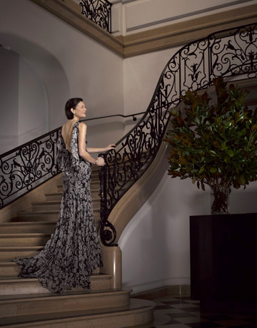
The museum website has photos from a number of magazine layouts that were recently photographed at the museum. How apt that the  elegant setting was used as a background for fashion and style in the 21st century. Diana Taylor, "New York's First Lady", in Harper's Bazaar, 2011, in patterned black and white, echoing the stunning grand staircase.

and from Quest Magazine, patterns and colors reflecting the detailed Klimt painting

To view the collection and the current exhibit, (Ferdinand Hodler: View to Infinity, is through January 7th) only takes a short time. Both the museum space and exhibitions provide a glimpse into a period in history that informed a lot of change in the creative arts and influenced a great deal of modern art and design.

Her Haven // Designing a difference for others

Her Haven grew from Carey Dougherty’s vision to combine her interior design skills, and business experience with her desire to help women in need. With the driving passion that a “home can enhance one’s well-being and bring families together, and the recognition that women are often selflessly serving their families and their communities with little time for themselves, she wanted to give these women the gift of a ‘haven’.

Her Haven is a nonprofit organization that performs volunteer design services for deserving and inspiring women in the community.

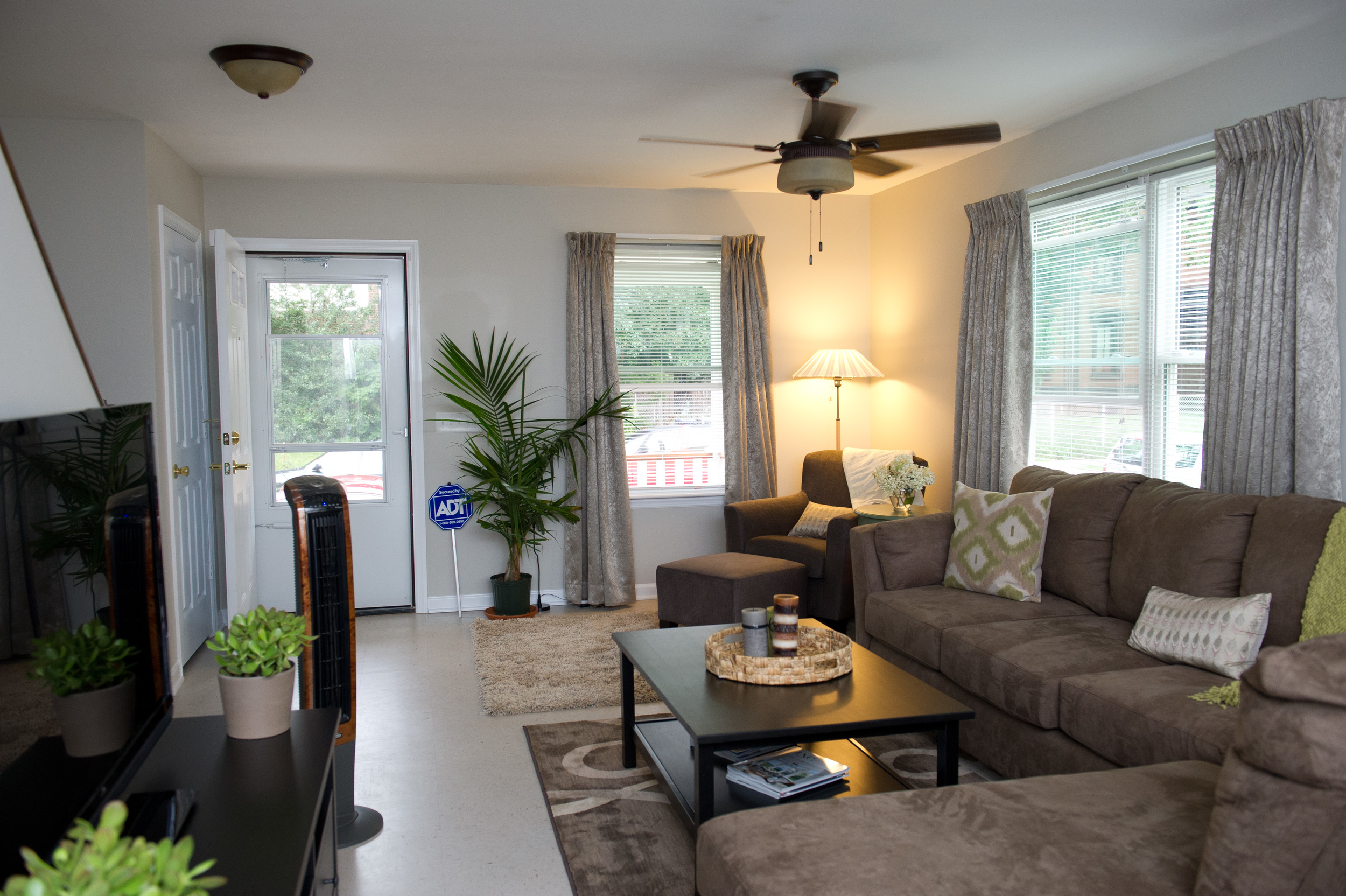
Carey then brought her organizational and networking skills to coordinate the efforts of various people and organizations. The first two Her Haven projects were a partnership with Fairfield University's Interior Design Program and Habitat for Humanity of Coastal Fairfield County.  11 design students from the program worked to redesign and furnish the living and dining rooms of two new Habitat homeowners, Nordia Black and Elizabeth Bosques, both of Bridgeport, CT.

The projects have elicited strong community support, from local businesses, supplying materials, trades, design skills and volunteers who have all helped see the projects to completion.

Another outcome of Her Haven's beginnings was a course at Fairfield University , developed by Dr. Catherine Giapponi, associate professor of management at the Dolan School of Business (DSB).“Managing Nonprofits Organizations". The course introduced students to careers in nonprofits, while helping to develop a business plan for Dougherty.  “There are many connections between entrepreneurship and starting your own nonprofit,” Dr. Giapponi explained, “And with entrepreneurship gaining interest around the world, this class gives students the skills to put together a complete plan that could be applied to nonprofits and for profit ventures.”

Her Haven has plans to expand its partner programs with additional design schools to provide both hands-on practical experience for it’s students with meaningful community work.

I was moved when Carey described a response to both projects. The women, who's home was renovated and furnished,  separately said, the best part of their new spaces was having, for the first time, “a dining table, a place to sit with their family”.

Her Haven is realizing Carey Dougherty's mission, helping women to create homes for their families that they would not otherwise have. Carey has in the process been bringing together diverse groups, from other non-profits, to  businesses, designers and educators.

Table d'Hote , table top and home accessories store, and Romanoff Elements are hosting an event Dec. 5th, with the artwork of Andrea Bonfils and Tulah Jems jewelry.  A portion of the evening's sales will help support the mission of Her Haven, Designing a Difference!


Its been wonderful to learn more about Carey's vision and organization that is effectively reaching out and bringing together resources and people who understand the value of a well-designed and comfortable space for all women and families.

An Artist's Perspective on Nature // from painting to photography

Andrea Bonfils loves the beauty in nature and as an artist works to capture the beauty and interpret it in her unique style. She has been creating mixed media works and paintings that reflect the outdoors, nature and the animals she loves and is now offering edited collections of her photography of nature. Andrea has been exhibiting and developing a following for her unique artwork. She has developed techniques using layers of oils, encaustic wax and photography combined with a great color sense which adds even more depth and dimension to her works.

The methods, like the subject matter are organic - they have evolved over time for Andrea. The encaustic wax melts and blends to create works that are individual and impressionistic. Her works are tactile - I was surprised to feel the smooth, glossy finish.

Andrea has always been photographing the subjects she loves as well. She spends time in CT and also in Sante Fe, NM - so her images combine the beauty of the east; the coastline, the snow and also the unique feel, with the textures and colors of the southwest; the flowers, sunsets and the wild horses that Andrea loves to spend time with and capture in her photographs.

“They are majestic, regal and powerful yet sensitive, engaged and vulnerable. Being in the wild with them and following their routine is one of the most enjoyable activities in my lifetime. If I can photograph and relay even a minuscule portion of that joy than the experience can be cherished repeatedly” and she adds, “Who does not loves horses?”

I have to agree...I have found that most people have extremely warm and positive response to beautiful and powerful images of horses.

Andrea photographs wild horses in two sanctuaries near her home in Sante Fe. One is private and the other is on the BLM (Bureau of Land Management, government funded and managed land) where they are protected from slaughter. Many are "3 strike horses" and lucky enough to be saved, much like kill shelter dogs. The politics and work involved in protecting the wild horses is limitless and there are many good people working on their behalf  - but still much needs to be done.

“...the wild horses are just another miracle of what inspires me in our fantastic natural world ...that which is my ultimate playground!”

These beautiful images in Andrea’s collections of horses and the other photographs of nature are a great new addition to her body of work.  They're available in a variety of sizes and framing options for  different finished looks; framed in hand-welded steel

printed on canvas

mounted in plexi

and framed in barnwood

Andrea's talents allow her to interpret the world of nature that she's drawn to -  her work continually evolves, whether in paint, mixed media or through her photography.

An American artist in Paris // New works by Xanda McCagg

Artist Xanda McCagg is spending the fall in Paris, leaving her Chelsea studio to exhibit, explore and experience life in Europe for a few months. The NYC based abstract painter spent time last year in Rome and France participating in two academic residencies which I blogged about this past summer. Her time there resulted in a new body of work and Paris' Galerie Charlot's interest to exhibit her paintings.

I have known Xanda for several years and I’m drawn to the colors, and composition of her work. It evolves and yet it remains familiar as she explores the themes that drive her work.

Together we have shown her work in Bridgehampton at Comerford Collection and placed a number of pieces with new collectors, both there and privately.

I think Xanda’s paintings are familiar due to their basis in figurative work. In the exhibit overview, McCagg says, “At the core of my work is a fascination with the human experience. I consider systems of human behavior in relation to larger happenings: poverty, war, systems of control and understanding, government, and religion vs. mythology. As an artist, I observe and comment on the human condition on both a global and an intimate level....

My work continues to explore the fine line between perception and imagination of these relationships through an articulation of compositional effects. Using line and form, I determine how much or how little information is necessary to communicate these shifts. Although abstract, my work is influenced by formal principles. I use these principles both literally and metaphorically as the vocabulary with which I develop my compositions.”

Valérie Hasson-Benillouche opened the French gallery in 2010. They exhibit both new, young artists, and established European artists, exploring a mix of classical and new media.

Xanda’s work ranges in size from from 8” squares to large format paintings, up to 72"x60". Her signature remains regardless of the size.

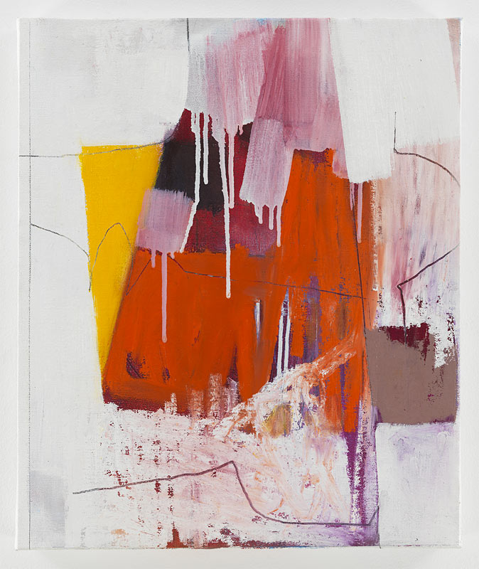
Xanda's color range is expansive - yet knowing Xanda's work, there’s a consistency. Her palette ranges from neutrals to the use of strong colors, composed of graphite, oils and collage, in a way that the paintings are always balanced with her unique combination of line, color, texture and form.

The exhibition is October 20 -Nov 17, Galerie Charlot , 47 Rue Charlot, Paris

I wish Xanda lots of success and a great experience in Paris this fall ...

Intro to LA art - Part 2 // LACMA

On Sunday afternoon in LA, the plan was to take a quick visit to The Los Angeles County Museum of Art, LACMA, with the intention of seeing the Metropolis ll installation by Chris Burden. Another day, another very different art experience than I'm accustomed to in NY. NYC weekend art viewing at a major museum is about long lines, crowds and trying hard to maneuver to actually see the art.  LA meant...sunny day, stroll among Robert Irwin's palm tree garden, seeing the outdoor exhibits and a few indoors, it was easy, no traffic and no crowds! The palms are an evolving installation, planted in a grid.

We walked around Chris Burden's, Urban Light....an installation created from a restored collection of over 200 cast-iron lampposts from throughout LA.

The outdoor courtyard takes you through and around a cafe that was quietly filled on this beautiful afternoon...I could imagine enjoying this year-round.  Different than NYC, the MOMA garden or roof of the Met are packed during the short warm weather months.

We stopped in to see the Ken Price Retrospective. An LA based sculptor, who passed away last year - he is recognized for blurring the lines between sculpture and painting. Frank Gehry, a friend of Price's designed the exhibit, an overview of his 50 years of work and contribution to the art of sculpture.

His early pieces reflects time spent in Taos, with Southwestern feel and colors. Many pieces have this sense of being exposed, one side contrasting to the rest, revealing the shape and color within.

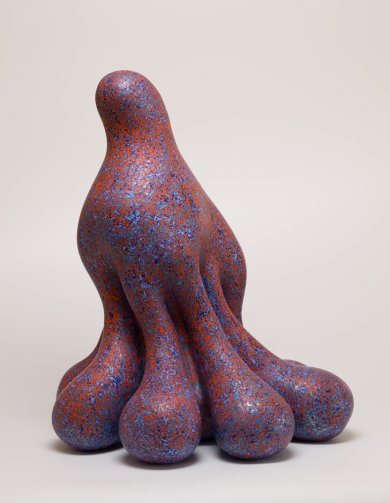
Price's recent and more well known work, are odd, rounded shapes that are all "lump and curve". He applied many layers of paint to achieve different luminous colors and textures, and meticulously smoothed the ceramic surface.

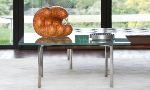
Philip Johnson's Glass House in New Canaan, CT is now exhibiting Doola, Price's last work before his death.

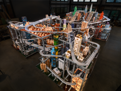
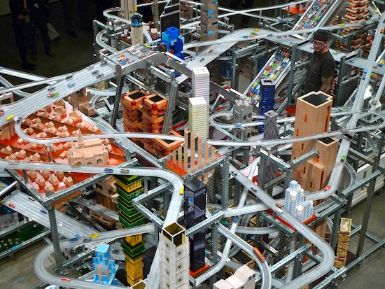
We head back across the courtyard to the timed showing of Metropolis ll...this is a pretty ambitious installation by Chris Burden. It's a kinetic sculpture that took 4 years to build, of a series of roadways, there are  100,000 cars that travel the 6-lanes on the 18 roadways

"The noise, the continuous flow of the trains, and the speeding toy cars, produces in the viewer the stress of living in a dynamic, active and bustling 21st Century city.", Burden says of his creation.

Unfortunately, our timing was off, and we didn't get to see Metropolis ll in motion, so I watched the video -

[embedplusvideo height="376" width="620" standard="http://www.youtube.com/v/llacDdn5yIE?fs=1" vars="ytid=llacDdn5yIE&width=620&height=376&start=&stop=&rs=w&hd=0&autoplay=0&react=0&chapters=&notes=" id="ep2312" /] On our way out, we saw Levitated Mass, or locally referred to as "The Rock", the infamous installation that took years from conception to installation

Michael Helzer conceived of this sculpture in 1969. Decades later he found the boulder he wanted in Riverside, CA. He then created the 456 foot long slat to support the rock above the pathway. Helzer's vision, "speaks to the expanse of art history, from ancient traditions of creating artworks from megalithic stone, to modern forms of abstract geometries and cutting-edge feats of engineering."

I heard stories of the journey of this boulder, the efforts to transport the 340-ton boulder, it travelled on a specially designed transport, over 11 days, through 22 cities, moving only at night. The planning and organization that this took....

The journey was documented and written about.

On this beautiful afternoon I enjoyed  seeing it from many angles, walking towards it, under it and contemplating the enormity of this stone and how...and why it was there.

I thoroughly enjoyed 2 days of LA art, and an intro to works by a number of diverse  local, and renowned artists.